By Stephen Baron, Advanced Statistics, Temple University, 2 August 2021
1. Research Question
In 2019, the City of Philadelphia approved measures to drive solar panel adoption, especially among residential properties: a solar rebate, a reduction in permit fees, enabling solar canopies, and an assessment for commercial properties. [1]
This research report examines the statistical significance of 54 solar installations spread throughout the city, mostly, but not exclusively, in residential properties. Nationwide, solar adoption tends to be wealthier and whiter [2], and owner-occupied households. [3]
This research report seeks to answer two questions: Is Philadelphia’s city’s solar panel adoption spatially statistically significant? And if so, does Philadelphia’s solar panel adoption follow nationwide trends of whiter, wealthier, and owner-occupied housing?
2. Measures
The main data set is from the City of Philadelphia via PASDA [4], and includes 54 solar installations in the city from 2016, most of which are residential properties.
These are analyzed in the first portion with Kernel Density Estimate, to see if the spatial distribution citywide, and particularly by total KW capacity by ZIP code, is statistically significant.
In the second section, the spatial distribution is analyzed using three variables measured by ZIP code based on the US Census American Community Survey 2018 5-year average: owner occupied households, percent white, and median household income. These variables will be analyzed using the OLS Regression Model, and local clustering analyzed using the Moran’s I and Local Moran’s I tests.
3. Methods and Results
Section I – Kernel Density Estimate
Figure 1. Solar panel installations in Philadelphia overlaid by ZIP code. There appears to be clustering in Old City/River Wards, South Philadelphia, and Northwest Philadelphia.
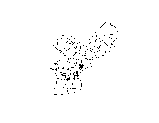
Figure 2. Solar panel installations in Philadelphia based on KW power. There’s clustering in Old City/River Wards and South Philadelphia, with higher installation capacity in South Philadelphia and Northwest Philadelphia.
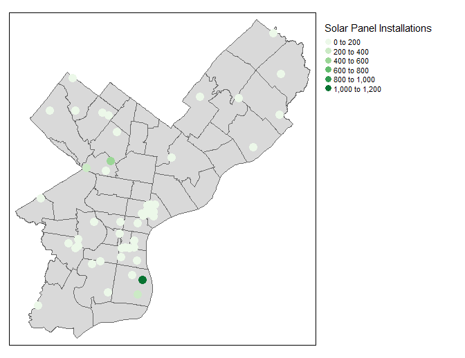
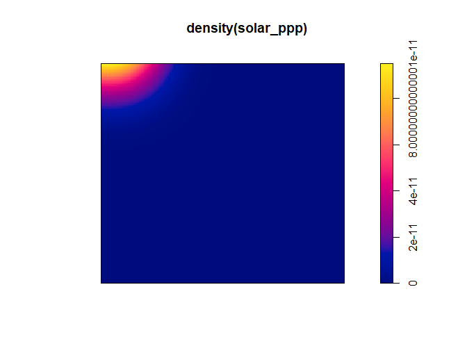
Figure 3. Solar density – We see what appears to be a concentration of denser solar panel installations in the higher value range, this is aligned with those in South Philadelphia.
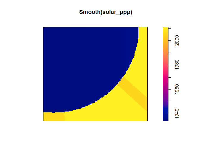
Figures 4a-d. Quadrant Density – These plots show the concentration of solar panel installations in a yellow arc from Old City/Riverwards down to South Philadelphia.


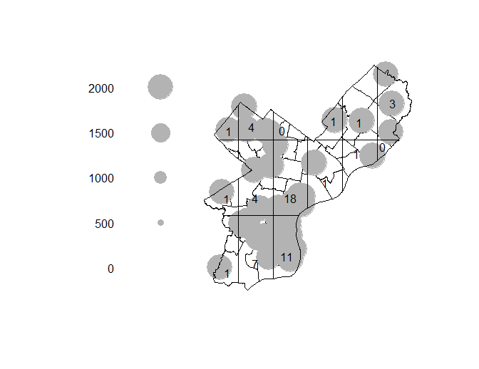
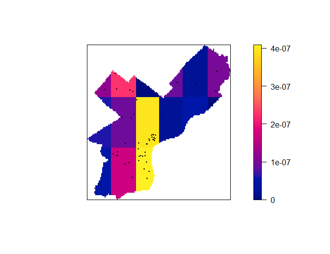
Figure 5. Average Nearest Neighbor
[1] 1385.681 meters to the nearest neighbor
[2] 1857.094 meters to the second-nearest neighbor
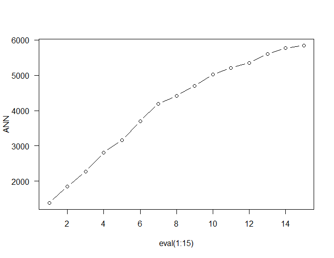
Figure 6. Kernel Density Estimate – These show the strongest impact of solar panel installations in South Philadelphia, radiating outwards, and to a lesser degree in Northwest Philadelphia. Are these statistically significant? We’ll measure those in the K, L, and G functions next.

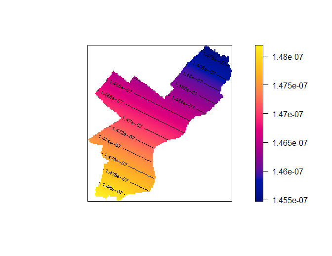
Figure 7. Measuring clustering of solar panels – K, L, G functions
Figure 7a. K Function – Shows the spatial distribution is above the hypothetical blue line of complete spatial randomness, indicating that it’s statistically significant spatial distribution.
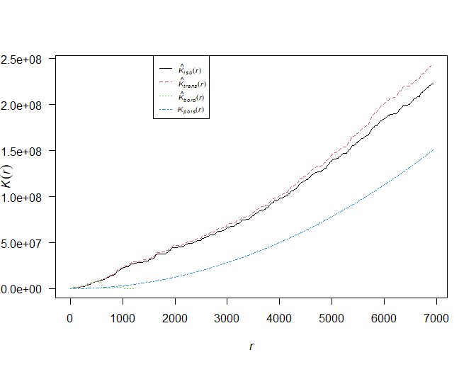
Figure 7b. L Function – The re-scaled version of the K Function on a horizontal plane, with the actual results being above the hypothetical blue line, indicating statistically significant spatial distribution.
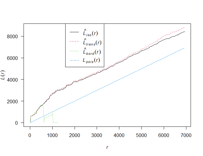
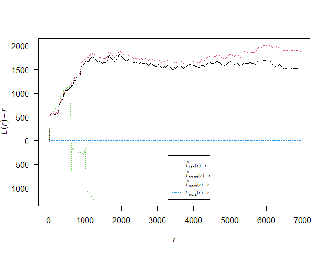
Figure 7c. G Function – As the readings start at 70 and slope downwards, this indicates a clustering of solar installations and KW. We can reject the null hypothesis of complete spatial randomness of the blue flat line at 1.
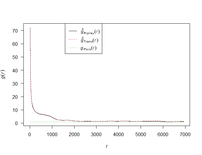
Figure 8. Voronoi and Thiessen – These show the clustering of solar installations by KW based only on the 54 sites. Voronoi (left), the highs and lows of KW, shows South Philadelphia and Northwest Philadelphia exerting a stronger influence, whereas Thiessen (right) shows the stronger influence of KW on surrounding polygons, again also in South Philadelphia and Northwest Philadelphia.
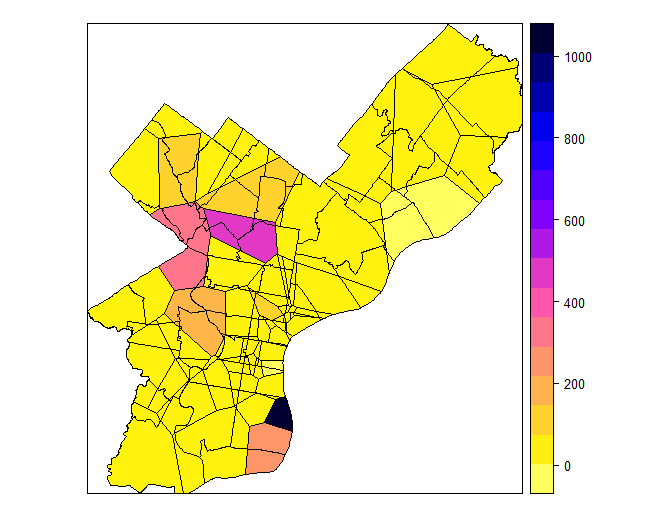

Figure 9. Inverse Distance Weighting – In estimating the KW capacity, this is based on the inverse distance of the cell to all locations. Inverse Distance Weighting takes into account all points, showing South Philadelphia as the strongest, followed by Northwest Philadelphia.
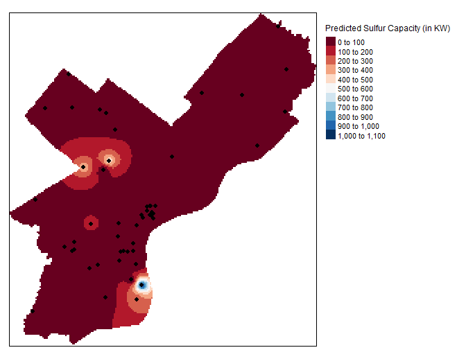
Figure 10. Kriging – Semivariogram and Kriging Prediction Map – Maps the spatial attributes of KW as predictors. Here, there’s no clear pattern, though perhaps a Wave model. There’s more confidence in South Philadelphia, where most of the readings are, then radiating north throughout Philadelphia.


Section 2 – OLS Regression Modeling – In this section, we’ll examine the statistical significance of solar panel adoption, measured in total KW by ZIP code, based on the variables: owner occupied households (ownerocc), percent white population (percwhite), and median household income (medhhinc).
Figure 11. Solar Histogram and Choropleth Map – First we examine the choropleth map of solar capacity by ZIP code. Most ZIP codes have little to no solar, though there appears to be clustering in Northwest Philadelphia, Old City/River Wards, and South Philadelphia.
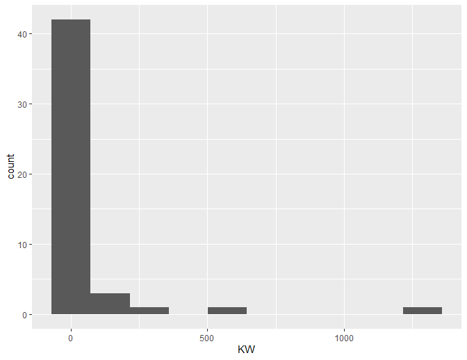
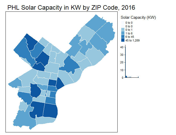
Figure 12. Scatterplots of solar capacity vs owner occupied, percent white, and median household income. No clear patterns emerge, though solar is slightly higher in owner-occupied ZIP codes.
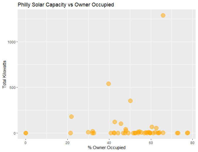
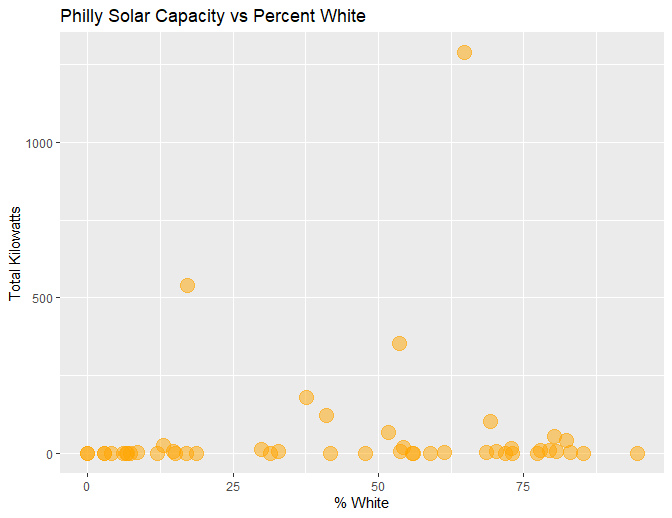
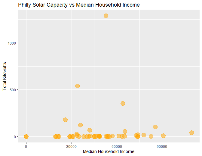
Figure 13. OLS Regression Model – ZIP codes that are whiter, with a slope of 89%, and owner-occupied households, with a slope of 61%, appear to be stronger indicators for solar adoption. Surprisingly, the median household income has a minor, negative slope. The model has a low R squared at only 1-6%.
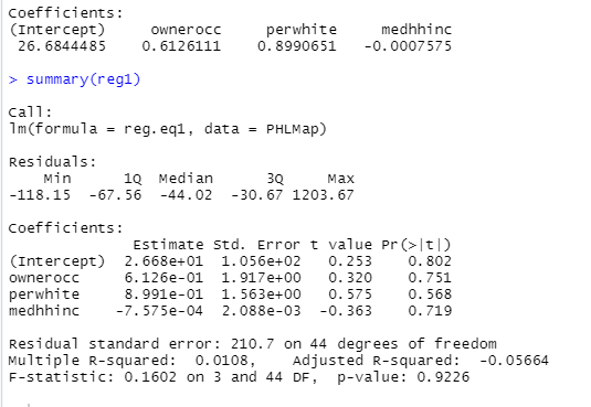
Figure 14. Plotting the residuals – There’s a slight positive spatial correlation among the residuals.
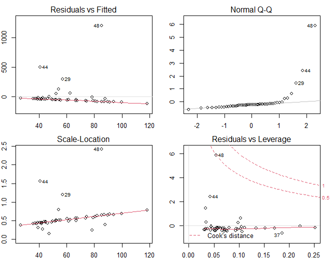
Figure 15. Lagged mean scatterplot and choropleth map – Show a positive spatial autocorrelation among the variables, especially in far South Philadelphia and Northwest Philadelphia.
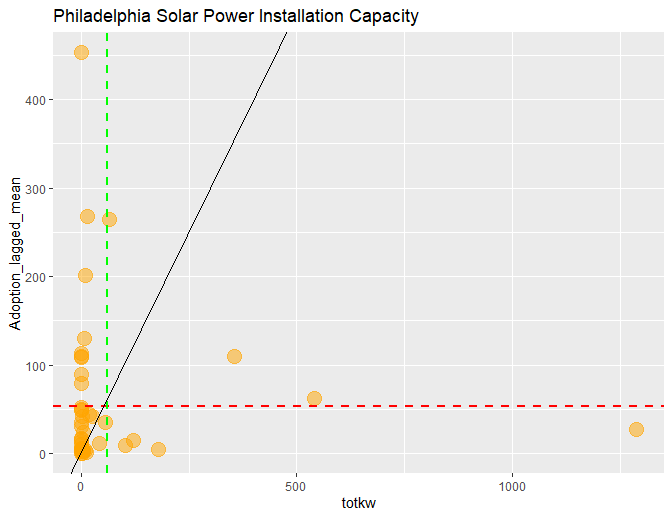
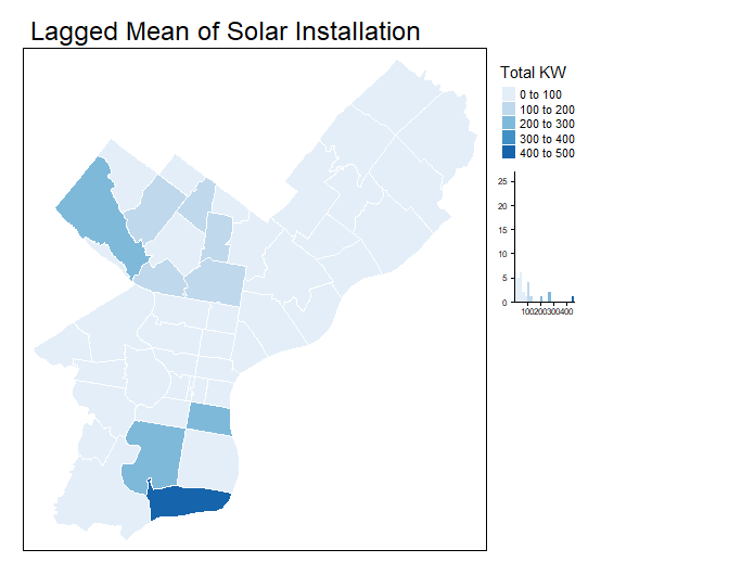
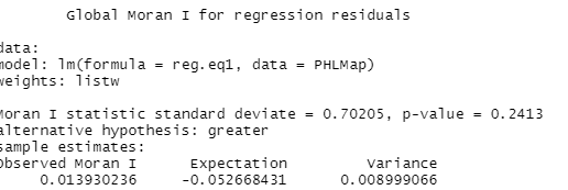
Figure 16. Global Moran’s I – Calculates on a global level if the clustering of KW of solar panels is statistically significant. As the Moran’s I and Expectations are different, we can reject the null hypothesis that the solar panel installation is completely random. However, the p value (0.4 in Moran’s I, 0.2 in Monte Carlo) is high – it may not be statistically significant measuring with these variables, there may be others that are not measured that could contribute to this positive spatial autocorrelation.
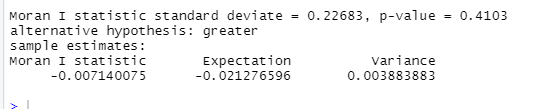
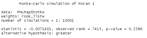
Figure 17. Local Moran’s I – Looks at local ZIP code clusters of high or low values in KW, with higher values appearing to be statistically significant in Northwest and far South Philadelphia.
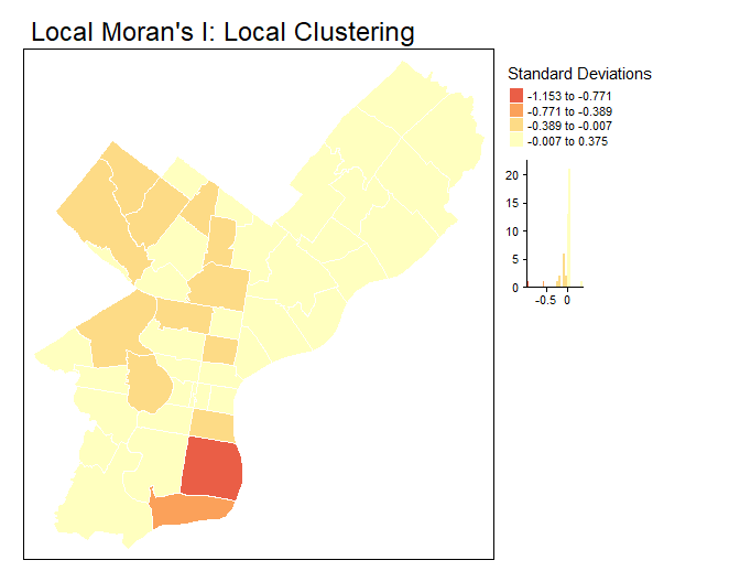
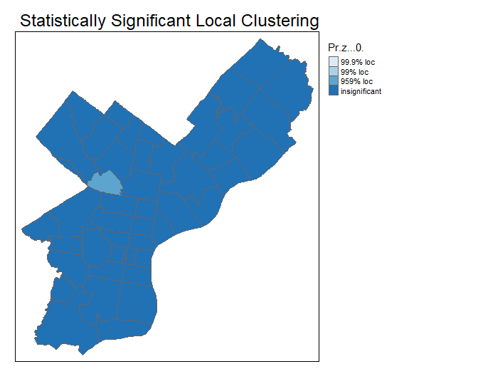
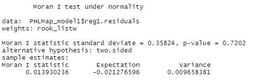
Figure 18. Checking for spatial dependency in residuals – Both Moran’s I tests demonstrate favoring the alternate hypothesis, that solar installation is statistically significant and not completely spatially random. However, both of the results have relatively high p values (0.7 for Moran’s I, 0.2 for the residuals), indicating that these variables may not be the best to be measuring.
Lagrange Multipliers – While neither LMerr nor LMlag has statistically significant p values, we’ll test out the spatial lag model for reference.
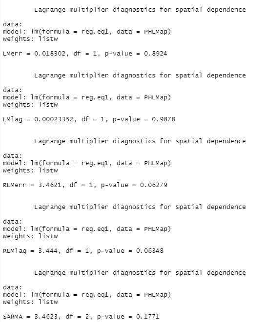
Figure 19. Spatial Lag Model – Part 1
Here, the t values, similar to slopes, are slightly positive for white and owner-occupied households and slightly negative for median household income, whereas the spatial lag t values are negative for both white and owner-occupied and slightly positive for median household income. However, the p values are all too high to have a 95% degree of confidence in these results.


Figure 20. Spatial Lag Model – Part 2
Here, the rho is similar to a slope, in telling the effect of neighbors’ y values on a ZIP code’s KW.
The overall rho for the formula with the 3 variables is 0.0039, it’s practically insignificant.

This next step creates an approximate confidence interval for rho. The rho’s slope ranges from 0.0039 to 0.2, which is still a relatively low equivalent to a slope. Percent white has the highest total impact at 0.904, followed by owner occupied at 0.619, and median household income with a slightly negative.
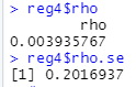
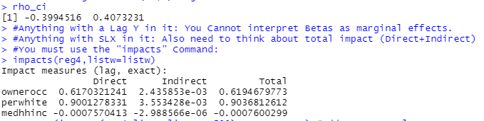
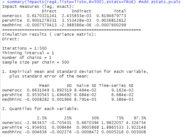
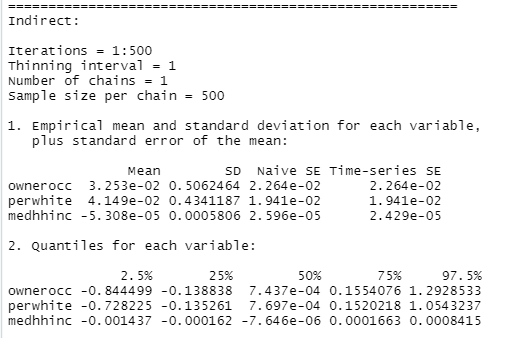
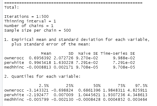

Figure 21. The Regression Model with Lagged Means – Runs the regression model with lagged means, in which each location is correlated with one another. The t values, similar to slopes, are strongest for white (0.569) and owner occupied (0.314), and negative for median household income (-0.358). Adding the lagged mean has a marginal effect, increasing the slope by only 0.025.

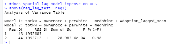
Using an Anova test, is the spatial lag model (Model 1) better than OLS? It’s practically the same sum of squares, and the p value is too high to be statistically significant. P is not significant, the OLS model may not be the strongest model, but it’s at least not indicating spillover or mismatch on the scale.
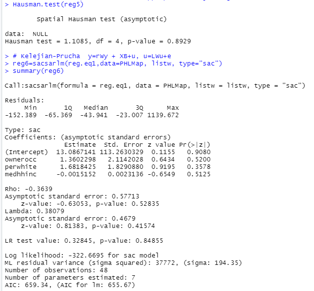
The SEM Spatial Error Model, which assess the residuals and specifies error dependence, shows slightly stronger z values for white (0.6275) and owner occupied (0.3853), and similar negative values for median household income (-0.3886). The lamda (0.039) is closest to a slope, and it’s also fairly small – though higher than the initial rho of the spatial lag model (0.0039).

The Hausman test compares the estimates from OLS to SEM. The Null result tells us that spatial error is appropriate.
4. Conclusion
In the first section, the Kernel Density Estimates, backed up by the K, L, and G Functions, and IDW, demonstrate that the solar adoption by ZIP code is statistically significant, particularly radiating outwards from Old City/Riverwards, South Philadelphia, and to a lesser degree Northwest Philadelphia. We can reject the null hypothesis that solar adoption is completely spatially random.
The Inverse Distance Weighting and Kriging both show the strongest influence of the tip of South Philadelphia, the 1.0 GW IKEA rooftop, and to a lesser extent Northwest Philadelphia.
In the second section, the OLS Regression Model shows that whiter and owner-occupied households do appear to have positive spatial autocorrelation with solar adoption, as they have strong slopes: whiter, with a slope of 89%, and owner-occupied households, with a slope of 61%. These would align Philadelphia with nationwide trends of whiter, owner-occupied households being early adopters.
Surprisingly, median household income has a minor negative slope. This could indicate that the City’s initiatives in solar rebates and outreach to lower-income households are working. Or that the solar sites themselves are in places that have wider availability of land in lower-income neighborhoods that have been disinvested and see less development. More research would need to be done.
The Moran’s I test shows that the clustering of solar panels in the three neighborhoods is statistically significant on a global aka citywide scale, and the Local Moran’s I that the higher values in South Philadelphia and Northwest Philadelphia are statistically significant and impact one another. We can reject the null hypothesis that solar adoption is completely spatially random.
In looking at the spatial lag model, the rho, or equivalent to the slope, is 0.039 for this formula with the 3 variables, and later corrected to 0.039 with the Spatial Error Model. Similar to the findings in the OLS Regression Mode, the percent white has the highest total impact at 0.904 (90%), followed by owner occupied at 0.619 (62%), and median household income with a slightly negative. The regression model with spatially lagged means adds only 0.025, which indicates that there may be some minor spatial autocorrelation among the variables and KW compared to the OLS.
Overall, while the variables chosen are the correct ones to analyze based on nationwide trends – owner occupied, white, and higher median household income – they may not be the most representative variables for Philadelphia’s solar adoption. Among the other factors in solar sites in Philadelphia could be open space or sustainability initiatives such as bonuses for green roofs. I’d also be eager to have a more updated database of solar installations, as the current data set is more than 5 years old – more data, especially on residential solar PV installations, would be useful.
5. Works Cited
[1] “Philadelphia Opens Applications for New Solar Rebate to Encourage Property Owners to Install Solar.” Philadelphia Energy Authority. 6 April 2020. https://philaenergy.org/city-opens-solar-rebate/
[2] “Residential Solar-Adopter Income and Demographic Trends: 2021 Update.” Electricity Markets and Policy. April 2021. https://emp.lbl.gov/publications/residential-solar-adopter-income-and
[3] “Income Trends among U.S. Residential Rooftop Solar Adopters.” Electricity Markets and Policy. February 2020. https://emp.lbl.gov/publications/income-trends-among-us-residential
[4] Philadelphia Solar Installations – 2016. City of Philadelphia. PASDA.


