A Tale of 3,218 Census Tracts: Pennsylvania’s Economic Inequality from 2010-2021 with Python’s PySAL

PySAL is a spatial analysis package in Python, which is used to test the spatial inequalities of Pennsylvania County Income. PySAL uses statistical functions to determine the significance of inequality measures based on geographical location.

This research report seeks to answer: How did Pennsylvania’s economic inequality change from 2010-2021, on Census Tract, County, and Regional levels?

‘Hazardous’ Neighborhoods: How Philadelphia’s Redlining Legacy Drives Gentrification and Income Inequality

After Philadelphia suffered from five straight decades of declining population, bottoming-out at 1.49 million in 2006, the city has since faced steady annual growth. [1] 

The city’s population growth has been fueled by Millennials, young families, and immigrants.  Upwardly mobile new neighbors are buying lower-cost homes, which is causing gentrification –  for this research report: a socio-economic restructuring that pushes out working-class residents. 

While gentrification is impacting many neighborhoods, not all are being impacted at the same rate. Gentrification is also driving citywide income inequality. [2]

This research report seeks to answer three key questions:

1. Where have Philadelphia’s Census Tracts gentrified?

2. What are the characteristics of gentrified Census Tracts?

3. What is the impact of historic “redlining” on gentrified Census Tracts?

I. Introduction: The Federal Government Graded Neighborhoods for Perceived Home Loan Risk in the 1930s

(Above) The 1937 HOLC Philadelphia map, via Hidden City Philadelphia.

In the 1930s, the federal New Deal established the Home Owners’ Loan Corporation (HOLC) to stem foreclosures. 

The HOLC graded cities for their perceived risk of paying back home loans, from “Best” in green, to “Hazardous” in red. Neighborhoods outlined in red are called “redlined.”

The HOLC took into account a variety of factors, including race – with lower grades for Black, Italian, or Jewish neighborhoods. In 1937, the HOLC created Philadelphia’s map (right), with the “ethnic” neighborhoods of South, Southwest, and North Philadelphia all being “redlined.”

Redlined neighborhoods became segregated by race and class, and could not get mortgages, or create generational wealth. With the G.I. Bill prioritizing home loans to White WWII veterans, and changing racial attitudes that Italians and Jews were white, the maps would presage “White flight” to the Northeast and suburbs from the 1950s onwards. [3]

II. Background on Gentrification

(Above) Philadelphia’s Society Hill was a model of “hyper-gentrification” in the 1960s, via Philadelphia Inquirer and Temple University Urban Archive.

Gentrification was first coined in 1960s London, when wealthy newcomers bought run-down mews and cottages and large Victorian houses, pushing out poor and working-class residents. [2]

In the United States, redlining, racial convenants, “block busting” (selling houses when non-White residents moved in), deindustrialization, and urban renewal caused Black and Latino inner-city neighborhoods to hollow-out in the 1950s-1970s. These processes, along with “White flight” to newly-built suburbs in the 1950s, set the stage for gentrification from the 1970s. [2]

Worldwide, gentrification accelerated in the 1990s. Qualitative accounts often frame gentrification as a negative – White, middle-and-upper class, newcomers push out lower-income minority residents, [4] and “there goes the neighborhood.”

However, studies of gentrification in Philadelphia and nationwide show that gentrification tends to happen in majority White neighborhoods, and does not displace the original residents. Gentrifying neighborhoods have lower crime and poverty rates, better educational opportunities, and more racial integration. [2, 4, 5]

In fact, the negative effects of gentrification on the neighborhood level may even be overstated. However, gentrification does drive city-wide income inequality, resulting in fewer lower-income neighborhoods, and driving an increase in poorer suburbs. [2, 4, 5]

III. Background on Philadelphia’s Gentrification

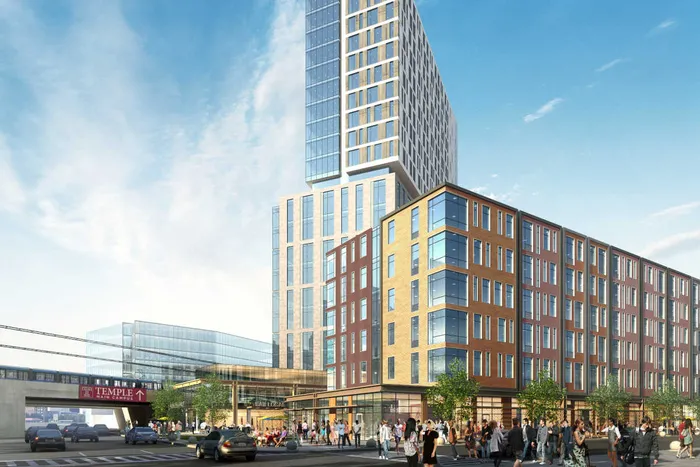
(Above) Artist’s rendering of the proposed North Station District at Broad Street and Indiana Avenue, in the once-redlined, now-gentrifying North Philadelphia neighborhood, via Spagnolo Group Architecture and Philadelphia Inquirer.

Philadelphia’s decline left many neighborhoods with high vacancy and poverty. The city was primed for redevelopment.

In Philadelphia, gentrification has accelerated since 2000, largely because of property tax abatements, Center City’s growth, and the expansion of university anchors in North Philadelphia (Temple University) and West Philadelphia (the University of Pennsylvania and Drexel University).

In a study of 50,000 Philadelphia adults, residents from gentrifying, non-Black, Census Tracts moved up. Middle-class homeowners sold their homes and moved to the suburbs or to another gentrifying neighborhood. Lower-income homeowners remained, as their neighborhood improved.

Middle-income renters stayed, with rents increasing by only $50-$126/month. There is debate on the fate of lower-income renters, who moved to equal or worse-quality neighborhoods.

Black, lower-income renters fared the worst: moving to lower-quality, non-gentrifying Census Tracts in the city or the suburbs. Fewer low-income neighborhoods remain. [4, 5]

IV. Data and Methods #1: HOLC Redlining Scores

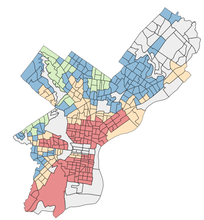
HOLC data are from the University of Michigan’s Institute for Social Research and the National Community Reinvestment Coalition. [6] They mapped the HOLC’s grades onto current Census Tracts. The HOLC did not grade all of the neighborhoods at the time, some, such as the Far Northeast or deep South Philadelphia, were not built. 

As some Census Tracts covered multiple original mapping areas, I’ve adjusted the grades to better reflect the new values: Best (Green, 1.00-1.99), Still Desirable (Blue, 2.00-2.99), Declining (Orange, 3.00-3.99), and Hazardous (Red, 4.00). Center City (in gray) either was not graded at the time, or the researchers are still working on digitizing the grades.

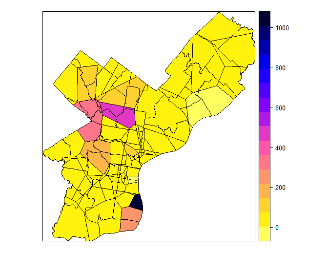
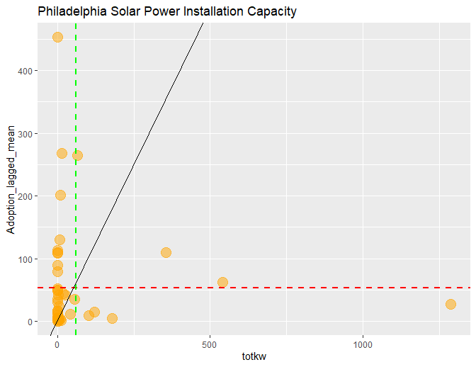
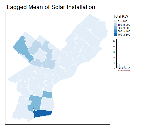
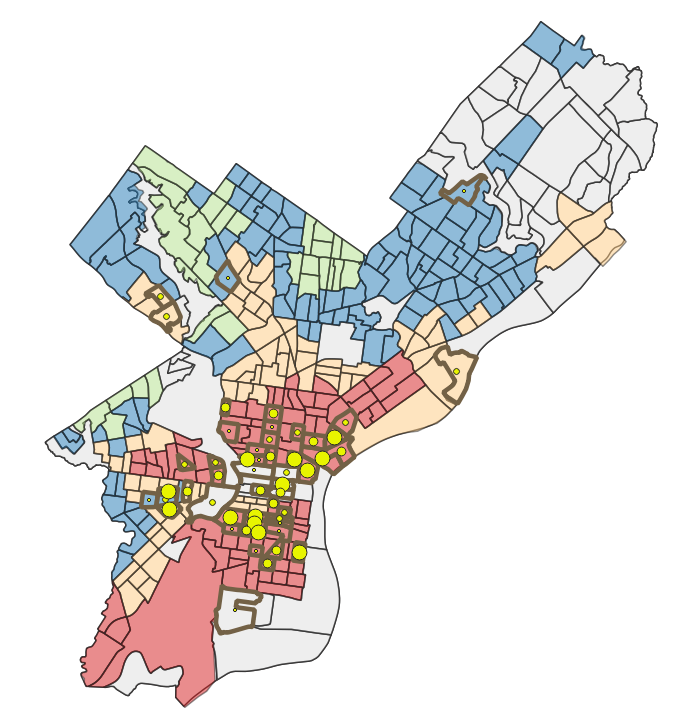
IV. Data and Methods #2: Gentrification Index

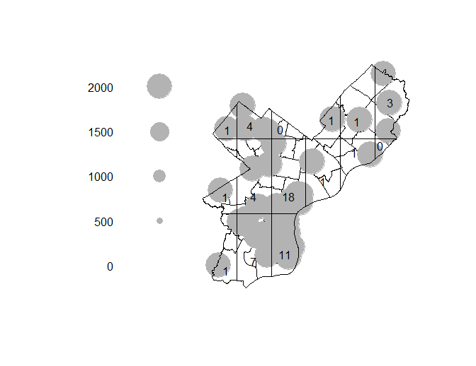
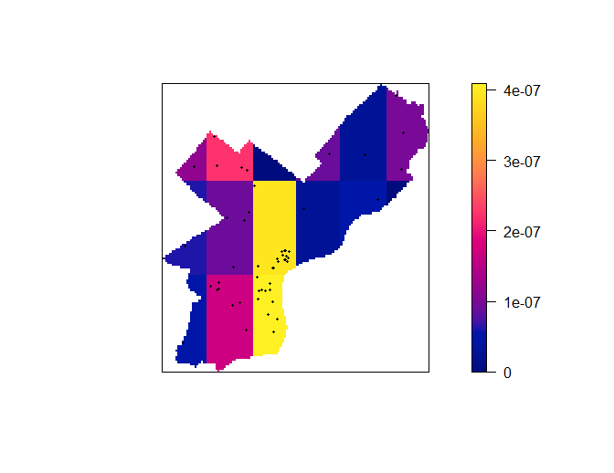
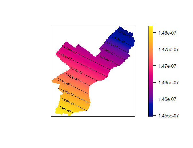
The Philadelphia Gentrification Index is calculated by Temple University – Geography and Urban Studies doctoral student Daniel Weise, who based the Census Tract-level index on a study of New York’s gentrification. [2] The Index is calculated from three variables for 2010-2015 (below). I then created Centroids for each of the Census Tracts, and created Graduated Circles for their values. The Census Tracts are outlined for ease of viewing.

1. Increase in Educational Attainment

A proxy for residents who have or have the potential to become high-income earners. Some studies use median rent or home values.

2. Increase from Renter-Occupied Housing Units to Owner-Occupied Housing Units

As gentrification increases, new owners change multi-family residences into single family homes, convert industrial lofts to upscale apartments, or convert co-ops or affordable housing to luxury condominiums.

3. Increase in Neighborhood Newcomers

Gentrifying neighborhoods have a higher number of residents who moved in the last 10 years. However, this may also capture lower-income residents who are displaced from gentrifying neighborhoods. Some Census Tracts that had positive gentrification values were removed upon further inspection of the neighborhood characteristics.

IV. Data and Methods #3: Gentrification Index

Overall, Philadelphia had only 52 out of 384 Census Tracts (13%) that gentrified in 2010-2015. The Gentrification Index values range from 3.72 to 37.07, which have since been re-scaled to four Gentrification Intensity grades by Equal Count (Quantile):  “Very Intense” (13.7-37.1), “Intense” (9.1-13.7), “Moderate” (5.5-9.1), “Weak” (3.7-5.5).

As the original data were not included in the Gentrification Index, I’ve created charts of Neighborhood Newcomers, Education, and Home Ownership rates based on analysis of the U.S. Census 2015 ACS (5-Year Estimate). [7]

I’ve calculated the averages of the values for the four types of U.S. Census Tracts:

1) Gentrified and redlined, 2) Gentrified and not redlined, 3) Not gentrified and redlined, 4) Not gentrified and not redlined

V. Results #1: More Neighborhood Newcomers

Neighborhood Newcomers, based on the average rate of the year in which residents moved into their housing unit, appears to be a stronger indicator of gentrification than home ownership.

Gentrified Census Tracts had more recent Neighborhood Newcomers. Gentrified but not redlined Census Tracts saw the most recent move-ins, with 2011 for renters and 2001 for homeowners.

Gentrified and redlined Census Tracts saw the second most recent move-ins, at 2011 for renters, and 2000 for homeowners. Not gentrified Census Tracts saw the same average year for move-ins regardless of redlining, at 2010 for renters and 1996 for homeowners.

V. Results #2: Home Ownership Remains High

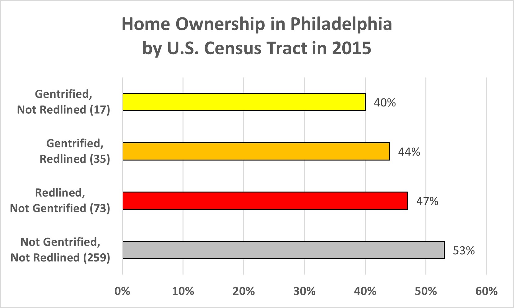
Despite the literature positing that gentrified neighborhoods have higher rates of ownership, the reverse actually appears here:  Gentrified Census Tracts have the lowest rates of home ownership (40% for not redlined, 44% for redlined). Not gentrified and not redlined Census Tracts have the highest rate (53%).

Still, Philadelphia has long been a city of homeowners. [4] In 2015, half (50%) of the city’s homes were owner-occupied, and 48% were rentals. Even in redlined, but not gentrified Census Tracts, home ownership is at 44%. [3]

V. Results #3: Educational Levels Rise Amid Gentrification

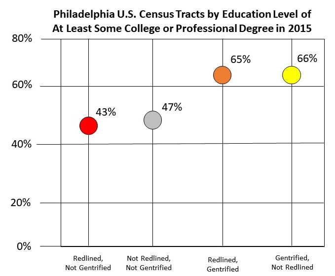
Gentrified Census Tracts are seeing higher levels of educational achievement.

About two-thirds of residents in gentrified Census Tracts (66% in not redlined, 65% in redlined) have at least some level of college education. Citywide, the average is 50% of residents are high school graduates or less, while 48% of residents have at least some college experience.

Residents in Census Tracts that are not gentrified or redlined are below those levels, at only 47%. Residents in redlined but not gentrified Census Tracts fare the worst, with only 43% having at least some college education.

VI. Conclusion: Overall Redlining vs Gentrification

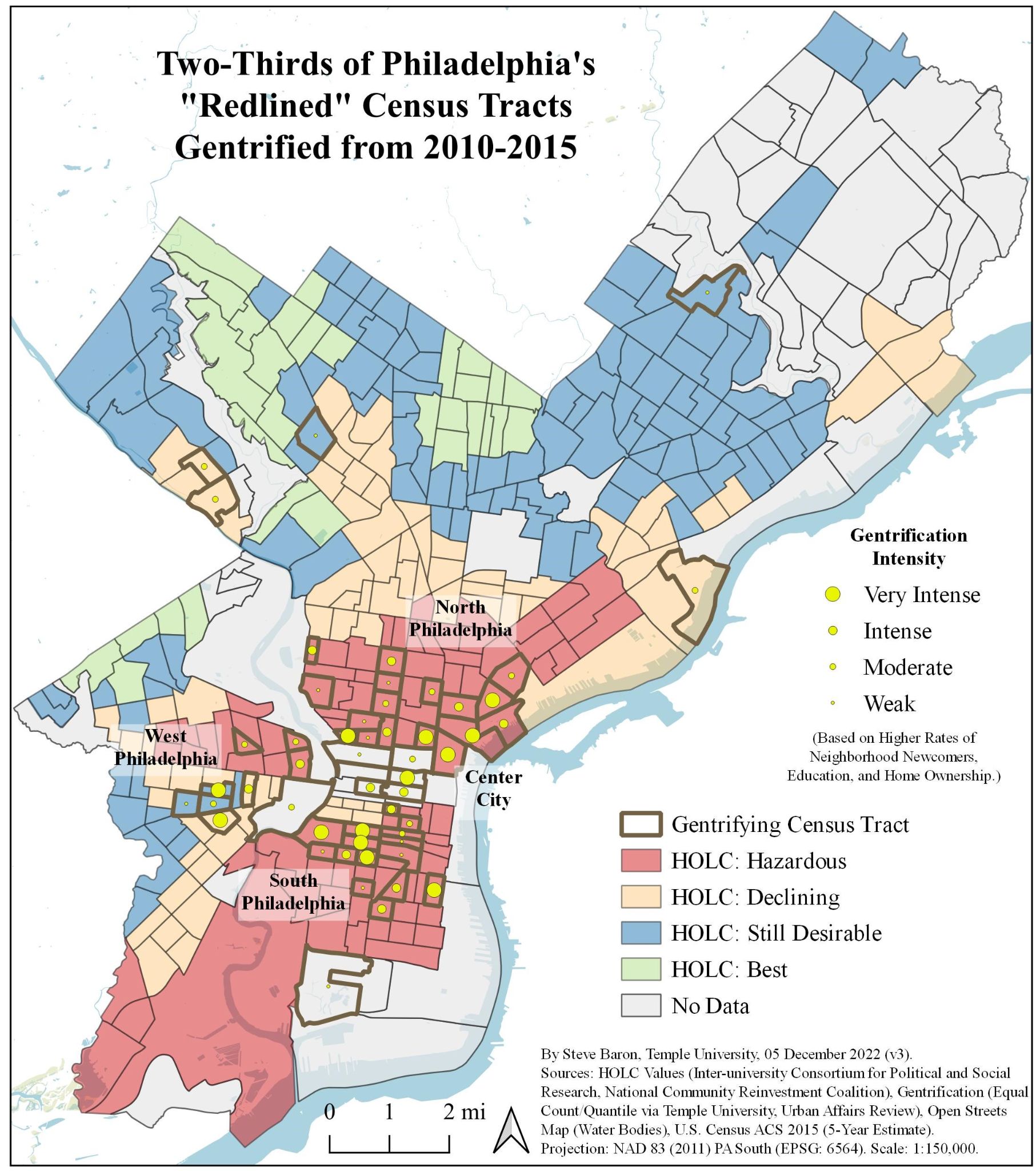
Two-thirds of Philadelphia’s gentrifying Census Tracts (35 of 52, 67%) were “redlined,” especially in North, South, and West Philadelphia. Gentrified Census Tracts have higher rates of neighborhood newcomers (homeowners and renters), and higher levels of educational achievement. However, gentrified Census Tracts do not have higher home ownership rates. This may be a result of the City’s unusually high homeownership rates compared to American cities.

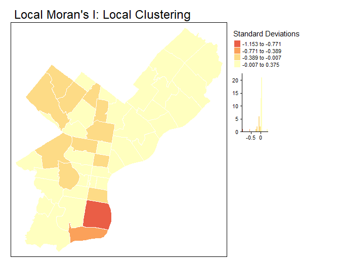
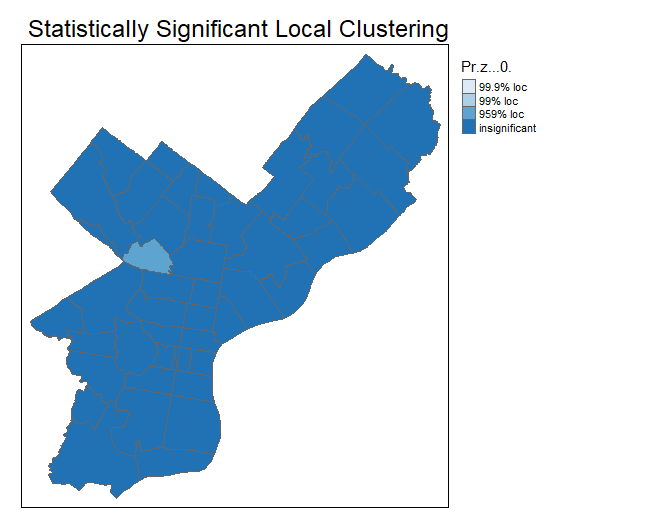
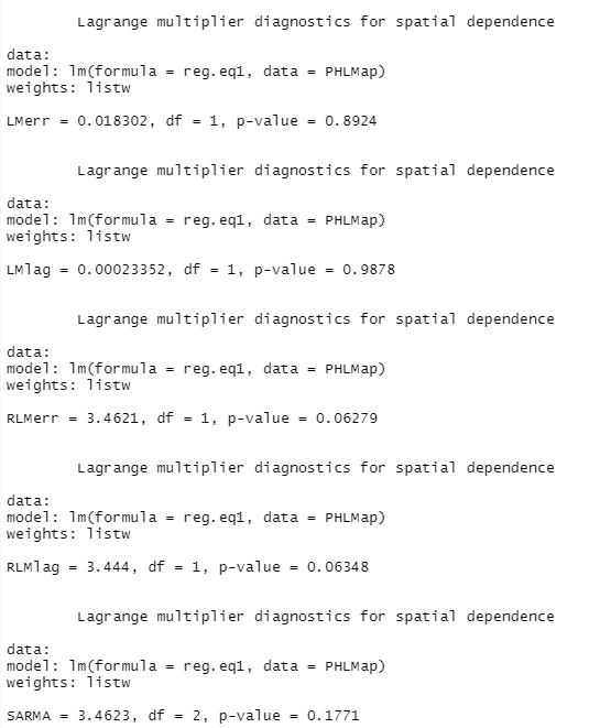
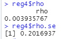
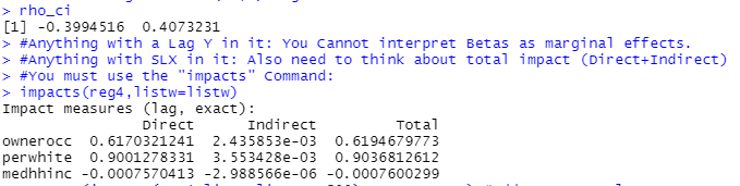
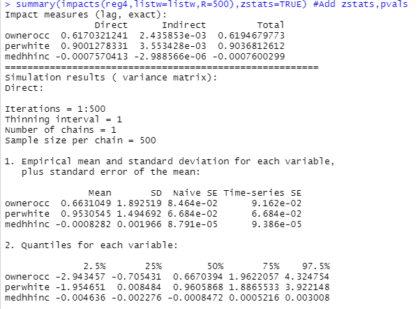
Statistical analysis paints a more complex picture. A t-test reveals a p value of < 0.0001. This means that redlining and gentrification values do have a statistically significant correlation. However, the correlation coefficient is 0.36, which represents a moderate correlation. Only 36% of gentrification values can be tied to redlining alone.

VII. Discussion #1: Lingering Legacy and Public Policies

(Above) Historical redlining vs violence and disadvantage via City Controller.

Even though the federal government’s Civil Rights Act of 1964 and the Fair Housing Act of 1968 banned housing discrimination, the legacy of redlining continues. [9]

Redlined Census Tracts have higher levels of disadvantage, and were “reverse redlined” – targeted for sub-prime mortgages during the Great Recession in 2007-2009. Redlined Census Tracts have also seen higher rates of homicides (nearly half, 152 out of 357, were in Census Tracts labeled “Hazardous”). Redlined Census Tracts even have less tree cover, compared to non-redlined Census Tracts.

Targeted government support could help homeowners and renters to remain in their neighborhoods, and prevent them from losing qualitative ties to their neighbors and groups.

More public-private investment in redlined neighborhoods could also increase their livability, and drive investment across more neighborhoods.

VII. Discussion #2: Neighborhood Racial Segregation

While beyond the scope of this project, there are stark racial differences driven by redlining. In 1930, the African-American population was only 11%. [8] Now, Philadelphia’s racial makeup is 62% non-White, 36% White, and 2% Other. 

Gentrified Census Tracts are majority White (57% for not redlined, 50% for redlined). But not gentrified Census Tracts are majority non-White (66% in redlined, 64% in not redlined).

VII. Discussion #3: Declining Neighborhoods

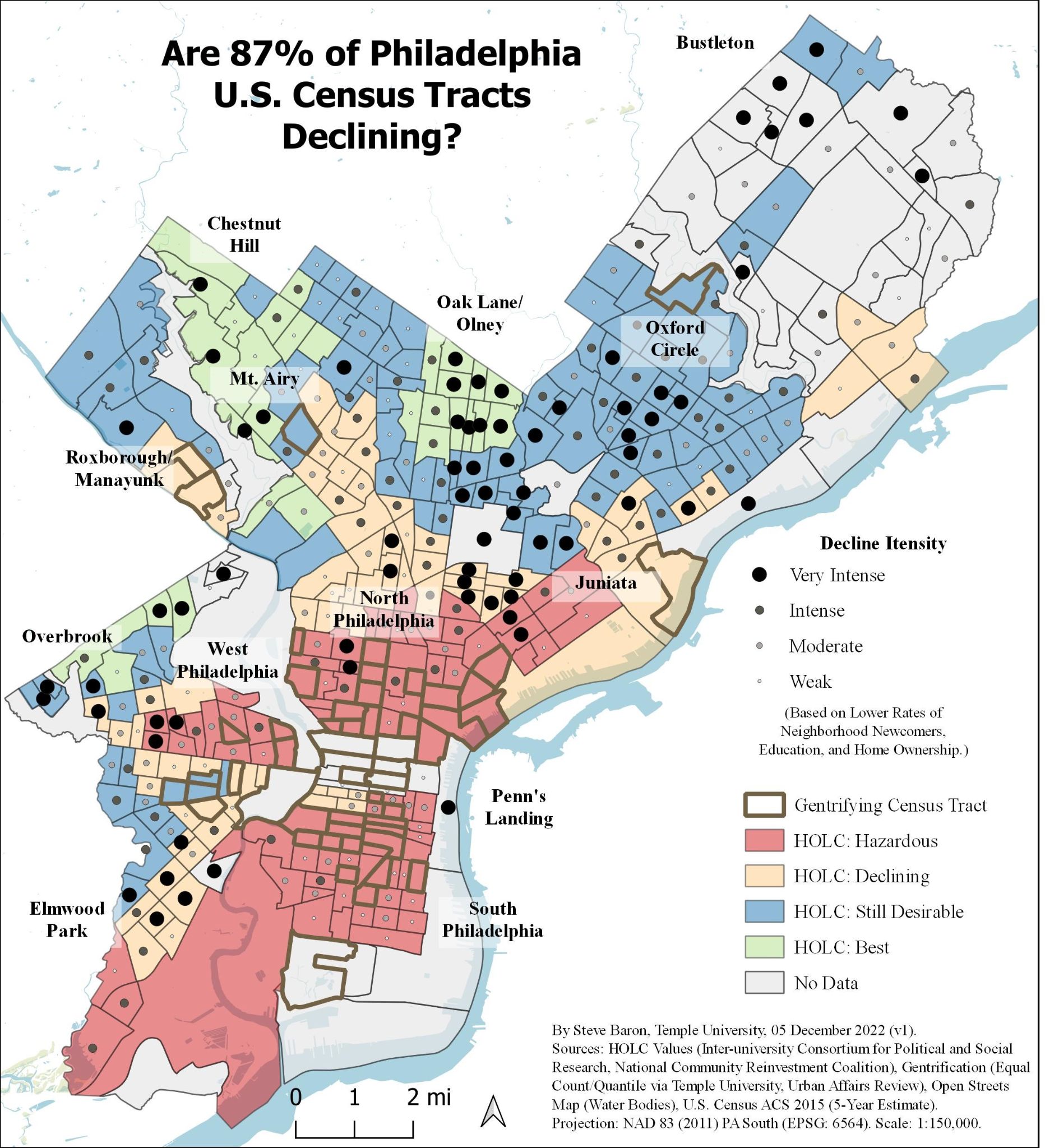
Did this research report miss the bigger picture of Philadelphia’s declining neighborhoods?

An earlier Pew study that analyzed gentrification from 2000 – 2014 found that there were 10x as many Census Tracts (164) that lost income compared to Census Tracts that gentrified (15). [10]

In mapping the reverse of this Gentrification Index – decreasing rates of neighborhood newcomers, home ownership, and education – nearly all (87%) of the city’s Census Tracts (292 of 384) have negative gentrification values. Some scholars call it “slumification.” [11]

This reveals an odd mix of neighborhoods: mostly upper middle class neighborhoods that were labeled “Best” such as Chestnut Hill, Mt. Airy, Oak Lane, Olney, and Oxford Circle, all of which are thriving.

But there are also the lower-middle class neighborhood of Overbrook, which was labeled “Best,” but has declined since, and lower-income Southwest Philadelphia.

More research is needed on what is driving neighborhood decline, the metrics to measure it, and the policies that could reverse decline.

VIII. Works Cited (in chronological order)

[1] “10 Trends That Have Changed Philadelphia in 10 Years.” Pew Trusts. 11 April 2019.

[2] Sutton, Stacey, “Gentrification and the Increasing Significance of Racial Transition in New York City 1970-2010.” Urban Affairs Review: Volume 56, Issue 1, 2018. 

[3] Cohen, Amy. “Repercussions of Racist Maps Still Impact Neighborhoods Today.” Hidden City Philadelphia. 16 December 2021.

[4] Hwang, Jackelyn & Ding, Lei. “Unequal Displacement: Gentrification, Racial Stratification, and Residential Destinations in Philadelphia.” American Journal of Sociology, 2020, 126:2, 354-406. 

[5] Brummet, Quentin and Reed, David. “The Effects of Gentrification on the Well-Being and Opportunity of Original Resident Adults and Children.” Federal Reserve Bank of Philadelphia, WP-1930, July 2019. 

[6] Meier, Helen C.S., and Mitchell, Bruce C. “Historic Redlining Scores for 2010 and 2020 US Census Tracts.” Ann Arbor, MI: Inter-university Consortium for Political and Social Research, 26 May 2021. 

[7] “U.S. Census: ACS 2015 (5-Year Estimates).” Social Explorer.

[8] Finkel, Ken. “Roots of Hypersegregation in Philadelphia, 1920-1930.” The Philly History Blog, Philadelphia City Archives. 22 February 2016. 

[9] Rynhart, Rebecca. “Mapping the Legacy of Structural Racism in Philadelphia.” Office of the Controller, City of Philadelphia. 23 January 2020.

[10] Bowen-Gaddy, Evan. “3 Maps That Explain Gentrification in Philadelphia.” WHYY. 14 March 2018.

[11] Azhar, A., Buttrey, H., & Ward, P. M. (2021) “Slumification” of Consolidated Informal Settlements: A Largely Unseen Challenge. Current Urban Studies, 9, 315-342. doi: 10.4236/cus.2021.93020.

IX. Additional Resources

[12] Ammon, Francesca. “RESISTING GENTRIFICATION AMID HISTORIC PRESERVATION: Society Hill, Philadelphia, and the Fight for Low-Income Housing.” Change Over Time, 8(1), 8-31,131. 

[13] Ding, Lei, Hwang, Jackelyn, Divringi, Eileen. “Gentrification and Residential Mobility in Philadelphia.” Regional Science and Urban Economics, 2016, Vol.61, p.38-51.

[14] Mitchell, Bruce C. and Franco, Juan. “HOLC “Redlining” Maps: The Persistent Structure Of Segregation And Economic Inequality.” National Community Reinvestment Coalition. February 2018.

[15] Mitchell, Bruce C. and Franco, Juan. “HOLC “Redlining” Maps: The Persistent Structure Of Segregation And Economic Inequality.” National Community Reinvestment Coalition. 20 March 2018.  https://ncrc.org/holc/

[16] Mitchell, Bruce C. and Meier, Helen C.S. “Tracing The Legacy Of Redlining: A New Method For Tracking The Origins Of Housing Segregation.” National Community Reinvestment Coalition. February 2022. 

Seeking Shade: Philadelphia’s Site Selection Suitability for Planting Trees to Reduce the Urban Heat Island Effect

Introduction: Legacy of Redlining Leaves a Lasting Impact

Philadelphia will see nearly 2 months of daily average temperatures at 95°F by 2100 (up from the 1 per year average from 1950-1999), and worsening “urban heat islands,” with heat-absorbing surfaces already causing a 22°F differential between the hottest and coolest neighborhoods, according to the Office of Sustainability’s report “Growing Stronger: Toward a Climate-Ready Philadelphia.”

This Environmental GIS course project seeks to answer the question: In order to reduce Philadelphia’s urban heat islands, in which Census Block Groups should the city plant more trees, with a focus on the most vulnerable populations?

Though Philadelphia was founded in 1682 as a “greene country towne,” by 2008 only 20 percent of the city had a tree canopy, according to the city’s Tree Canopy Assessment. In response, the Philly Tree Plan would see 30 percent of the city covered with a tree canopy by 2050.

One of the biggest challenges is “heat inequity,” in which formerly “redlined” neighborhoods experience “intra-urban” heat islands, according to the report “Beat the Heat: Hunting Park.” In Hunting Park, a formerly redlined neighborhood, the City has successfully installed green infrastructure to reduce the urban heat island effect.

Data and Methods: Creating a Multi-Risk Hazard Index

In this project, I built on the Philadelphia Heat Vulnerability Index to create a Composite Multi-Hazard Risk Index to identify the US Census Block Groups that should be prioritized for planting trees. I downloaded the data, reclassified the data into Quantile 5-class, and created two weighted sub-indices and a final Composite Risk Index (Figure 1, below).

Figure 1 – Weighted Indices. Creating the Heat Hazard Index, Social Vulnerability Index, and the Composite Risk Index.

The Heat Hazard Index includes the PASDA Philadelphia Land Cover Raster 2018, USGS Landsat Collection 2 Surface Temperature Raster, and Open Data Philly’s Philadelphia Tree Inventory (2021).

The Social Vulnerability Index uses US Census: American Community Survey 2020 5-Year Average data, using the percent of households with a senior citizen (at least 60 years), living alone, below the federal poverty line, non-white, with a high school diploma/GED or less, with a disability, and without health insurance.

Results: Heat Hazard, Social Vulnerability, and Composite Indices

The Heat Hazard Index (Figure 2, below) shows the highest risk areas are in North Philadelphia/Lower Northeast, West and Southwest Philadelphia, and deep South Philadelphia. There are 353 out of 1,338 Census Block Groups (26 percent) that have a value of 4.0 or higher out of 5.0 on the Heat Hazard Index.

Figure 2 – Heat Hazard Index. Highest risk areas (pink) are North Philadelphia/Lower Northeast, West/Southwest Philadelphia, and deep South Philadelphia.

The Social Vulnerability Index (Figure 3, below) shows the most vulnerable populations live in North Philadelphia, West Philadelphia, and parts of South Philadelphia. There are 41 out of 1,338 Census Block Groups (3 percent) that have a weighted index value of 4.0 or higher out of 5.0.

Figure 3 – Social Vulnerability Index. The most vulnerable populations (pink) live in North Philadelphia, West Philadelphia, and South Philadelphia.

Conclusion: Hotspots in North, South, and West/Southwest Philly

In the Composite Risk Index (Figure 4, below), the hotspots are in North Philadelphia, (industrial legacy and abandoned factories), deep South Philadelphia (sports complex parking), and West/Southwest Philadelphia (possible failed urban renewal), and the Lower Northeast (light industrial). There are 207 out of 1,338 Census Block Groups (15 percent) that have a value of 4.00 or higher out of 5.0.

Figure 4- Composite Risk Index. The highest priority areas (pink) are in North Philadelphia, West/South Philadelphia, and deep South Philadelphia.

In (Figure 5, below) comparing the City’s Heat Vulnerability Index (left) with this report’s map (right), the two maps are fairly similar. This report’s map (right) shows a larger hotspot in the Lower Northeast, which may be because of the higher Heat Hazard Index weighting.

Figure 5 – Final Indices Comparison. Both maps show hot spots in North Philadelphia, deep South Philadelphia, and West/Southwest Philadelphia. This report’s map (right) shows a larger hotspot in the Lower Northeast.

Discussion: Practicality of Planting Trees in the Hotspots

Despite identifying the urban heat island hotspots and places to plant trees, this project raises more questions than answers.

Even in the final high priority Census Block Groups, is it practical to plant trees in all of these locations, especially in parking lots or private properties? The City also needs to ensure that urban-resilient and high-shade trees are planted. This report also does not take into account the neighborhood histories – for example, could the industrial sites be environmentally contaminated?

In creating the indices, while I’ve based them on a review of literature, I’d prefer the weights to be validated by a third party. Unfortunately, the City’s Heat Vulnerability Index does not list the processes or weights. The City also includes community assets such as pools and parks, and uses CDC data that are not readily available.

Finally, is the focus on tree planting alone enough – as Hunting Park shows, could more be done for holistic green infrastructure: painting roofs white, building parks, creating smart streets, or enhancing building energy efficiency? -Ends-

Drill, Baby, Drill: Spatial Analysis of California’s Oil and Gas Wells

Milestone 5: Final Report, Spatial Database Design, Temple University
by Stephen Baron, 27 April 2022

1. Dataset

This dataset is “Oil and Gas Wells Table, California” (https://gis.conservation.ca.gov/portal/home/item.html?id=0d30c4d9ac8f4f84a53a145e7d68eb6b), with 241,017 rows of data about individual wells across the state.

The data is in the coordinate reference system WGS 1984 (4326) (contrary to the data dictionary, by uploading the data to QGIS, it reveals the data is in 4326, not 3857 WGS84 Pseudo-Mercator). During the project, the data will be transformed into 3310 California Alberts NAD1983 in feet.

This dataset is is produced by the Geologic Energy Management Division (CalGEM), formerly the Division of Oil, Gas, and Geothermal Resources (DOGGR); much of the data still references DOGGR. CalGEM oversees the drilling, operation, maintenance, and plugging and abandonment of oil, natural gas, and geothermal energy wells. CalGEM’s authority extends from onshore to three miles offshore. [1]

California’s oil production began in the late 1800s. CalGEM was formed in 1915 to ensure the safe development and recovery of energy resources. CalGEM’s authority extends from onshore to three miles offshore. [1]

While California is a top-10 oil-producing state, the state has also seen production decline since the 1980s. Furthermore, CalGEM is driving California’s goals to become carbon-neutral by 2045, seemingly at odds with continuing oil and gas exploration and pumping. [1]

California approved more new wells in March and April 2022 than in any two-month period since October 2021. News reports cited increased demand for oil and gas due to due to the Ukraine war, and the federal government opening more  public land to energy drilling. [2]


This dataset can be used for many analyses, such as identifying different types of wells, their status, location, and when they were drilled. Among the uses are one could identify where new wells should be drilled, or where old wells should be plugged or re-activated, or also do an analysis of well ownership.

This dataset is ideally used in conjunction with other datasets, such as US Census data. For example, though it’s beyond the scope of this assignment, one could analyze the wells in relation to high-risk communities of color or high poverty. One recent study shows that historically redlined neighborhoods are burdened by excess oil and gas wells, leading to pollution and public health issues. [3]

This research report will analyze 3 questions:

1) Which are the well ids, owners, status, locations, and distance in miles of the 5 nearest wells to the intersection of Hollywood and Vine?
Question #1 shows the extent to which oil and gas wells permeate even the most touristic intersections in California. Question #1 also includes using the PostGIS TIGER (Topologically Integrated Geographic Encoding and Referencing system) Geocoder, which turns the intersection into geographic coordinates. TIGER Geocoding involves downloading US Census road datasets of the US and California.

2) Find the distance in miles from the wells in the northernmost county of  Siskiyou, to the nearest well in the southernmost county of San Diego.

Question #2 shows the state-wide extent of wells, and could support further oil and gas pipelines.

3) In light of rising demand for natural gas, which 10 new or active dry gas wells are closest to Los Angeles county? Do not include wells in Los Angeles county. List the well id, operator name, well status, well type, and county name.

Question #3 shows the potential for optimizing natural gas wells near Los Angeles to meet rising energy demand, and also outside of Los Angeles county’s boundaries.

2. Structure of the Data and Normalization

In creating the tables, one creates the lookup tables first, as the info table then references them.

Table #1: status – This has two fields: well_status, a one-word primary key, and status_descr, which describes the status of the well. The Data Dictionary

well_status: There are 8 values in caallwells: Active, Buried, Canceled, Idle, New, Plugged, PluggedOnly, and Unknown. Three values (Buried, Canceled, and PluggedOnly) are not in the Data Dictionary, but are added based on caallwells.

status_descr: Based on the Data Dictionary descriptions.

Table #2: well_type – This is a two-letter code that indicates the well type. While the Data Dictionary lists only 14 well types, there are actually 19 values in the caallwells data set, below. There are only two fields: well_type, the primary key and the two-letter code, and the type_descr, the description.

(The Data Dictionary has only 14: AI, DG, DH, GD, GS, LG, OB, OG, PM, SC, SF, WD, WF, WS.)

Table #3: base_meridian – This is a short lookup table, which defines the base principle meridian for the Public Land Survey System (PLSS) and is required for all California surveys. There are only two fields: the meridian, the one-or-two letter primary key, and meridian_descr, which describes the meridian.

Table #4: gis_source – This is a short lookup table, which has a 3-letter code, gis_source, the primary key that describes the method by which the well location was established. There are only two fields: gis_source, the 3-letter code, and the gis_descr, which provides the description. There are 8 values.

There’s a discrepancy between the Data Dictionary and the caallwells data: The caallwells uses GPS, hud, mip, Notice of Intent to Drill, Operator, Unknown, and Well Summary, which are then standardized into 3-letter codes in gis_source, and also adds in DOQ – Digital Ortho Quad, which is in the Data Dictionary but not in the caallwells; DOQ may be used elsewhere in California state datasets.

Table #5: ownership – This short lookuptabledescribes the ownership of the wells. There are only two fields: opco (operatorco in caallwells, opcode in the Data Dictionary), a 5-digit unique identifier of letters and numbers that also serves as the primary key, and opname (operatorna in caallwells, opname in the Data Dictionary), which has the full name of the operating company.

Table #6: region – This table primarily relates to the geographic region in which the wells are located. There are 9 fields: apid, the primary key and a unique identifying integer given by the American Petroleum Institute (API).

There are additional identifying characteristics, which would be of primary interest to well owners: with the district (there are 4 distinct districts: Coastal, Inland, Northern, Southern), area_name (there are 212 distinct area names), field_name (there are 504 field names), county_name (there are 59 distinct counties: 58 of California’s counties, plus one for Los Angeles Offshore for offshore wells).

The next 3 fields – well_range, township, and well_section – are from the Public Land Survey System (PLSS). Raneg is the widest, there are 74 values. Township is second most general, there are 67 values. Section is the most specific, but they’re not unique identifiers, as different townships can have the same section. Unfortunately, these 3 fields are not specific enough to narrow down a well’s location, and cannot be combined to create a primary key, hence using the apid as a second unique well identifier.

The final value, geom, is a geographic point for the well, based on latitude and longitude from caallwells.

Table #7: well – The central table, which contains most of the identifying information about the wells. Among the fields, well id is the primary key, a serial number generated when importing from QGIS.

There are 6 foreign keys: well_status (linking to the status table), well_type (linking to the well_type table), opco (linking to the ownership table), meridian (linking to the base_meridian table), gis_source (linking to the gis_source table), and apid (linking to the region table).

Among the remaining fields, well_number is likely a number given by the operating company, there are 99,479 distinct well numbers, not enough for a unique identifier for each well. There are two fields that are Boolean true/false values: confidential (if subsurface information is held confidential for 2 years) and directional (whether the well was directionally drilled or not).

Additionally, spud_date is the date in which the well was drilled. As many fields are blank, due to incomplete data for older wells, blank text is converted into null in the SQL script below.

The field symbol is a combination of well_type and status, and geom is a geometry created from the latitude and longitude in caallwells. The field lease_name is either given by the State or by the operating company, there are 20,500 distinct lease names; not enough for a unique identifier.

3. Optimizations

This research report does not include index construction. There is one instance of denormalization, and that is including geometry in both the well and region tables. This is done for Question #2, to calculate distance between wells in the state, as one uses well id and one uses region apid.

4. Three Analytical Queries

Image 1: Locations of all oil and gas wells in California, overlaid on county boundaries.

Question #1. Which are the well ids, owners, status, locations, and distance in miles of the 5 nearest wells to the intersection of Hollywood and Vine? This shows how prevalent oil and gas wells are in California, even near a major tourist spot.

First, upload the California geocoder data set. There’s an in-depth process to install the PostGIS TIGER geocoder, creating tiger and tiger_data schemas, granting usage, and downloading data directly from the US Census Bureau’s website. Then one has to create nation and state scripts for California, and set the path to those.

As the TIGER geocoder was already installed for a previous project, this skips to installing the California state dataset, so that one can get the geographic coordinates for Hollywood and Vine. The below format will bring up the top 5 results for Hollywood and Vine’s latitude and longitude. ZIP code is from Google Maps. */

Hollywood and Vine: -118.32668 longitude, 34.101622 latitude

The results show at least 10 wells within 0.5 miles, which is quite surprising, though 9 of them are plugged and 1 is idle.
Image 2: Location of the 10 wells (in pink) nearest to Hollywood Boulevard (running east-west) and Vine Street (running north-south), both highlighted in yellow. This overlays the Los Angeles streets centerlines .shp file.

Question #2. Find the distance in miles from the wells in the northernmost county of Siskiyou, to the nearest well in the southernmost county of San Diego.

This intends to show where wells are located throughout the state, and could also be used to support the development of oil and gas pipelines.

In this exercise, one first selects the Siskeyou well (a.id, r.county_name = ‘Siskiyou’). The subquery measures the distance from the Siskeyou wells (a.geom) to the San Diego wells (b.geom, joined by region as g, and g.county_name = ‘San Diego’).

The construction b.id || ‘, Distance: ’ || is used to include both the well and the distance in the second column, which cannot be done otherwise. Here, one transforms both values into 3310, the NAD83 State Plane for California Albers, and divides by 5280 feet for miles.

One then orders the wells by geographic nearness using the KNN operator <->, here in the b.geom <-> a.geom, and limits them to one well each (limit 1).

Image 3: Location of all wells in Siskiyou county (the northernmost county) and San Diego county (the southernmost county).

Image 4: Locations of 2 wells in Siskiyou county and the nearest well in San Diego.

Question #3. In light of rising demand for natural gas, which 10 new or active dry gas wells are closest to Los Angeles county? Do not include wells in Los Angeles county. List the well id, operator name, well status, well type, and county name.

The top part should look familiar, in selecting the different attributes and joining the ownership and region tables. Instead of st_distance, this uses the KNN nearest neighbor operator <-> in ordering by the well id and nearness to Los Angeles county, and limiting the results to 10. This uses apid != apid, so the same wells are not chosen to themselves.

Of the 10 nearest wells, 9 are active and only 1 is new. Most of the wells are in northern California, in Sacramento County; or Colusa County or Glenn County, both of which are north of Sacramento. Kern County is closer to LA, in Bakersfield.

Image 5: Location of the 10 Active or New dry gas wells (pink) that are nearest to Los Angeles county (blue) that are not located in Los Angeles county itself.

5. ETL Process and Appendices

a. Appendix A: How to Obtain and Load the Data
This dataset is “Oil and Gas Wells Table, California,” which is downloaded as a .csv from CalGEM: https://gis.conservation.ca.gov/portal/home/item.html?id=0d30c4d9ac8f4f84a53a145e7d68eb6b.

Once the dataset is downloaded, one can use QGIS to import it into DBManager. First, in DBeaver, create an sddfinal schema.

In QGIS, click on DB Manager, connect to PostGIS. Click on Import Layer/File, and connect to the universe database (dbname=‘universe’, host=localhost, port=5432, sslmode=disable, username: postgres, password: postgres). Import this .csv as caallwells into the sddfinal schema. Primary key: id, geometry column: geom, source/target SRID: 4326. Convert field names to lowercase.

In DBeaver, set the search path to the sddfinal schema, public, and postgis. The caallwells table has 241,017 rows of data about onshore and offshore wells across California. One can check this by selecting all on the caallwells table.

c. Appendix C: Denormalization and Index

The only instance of denormalization is in having the geometry field in both well and region tables.

d. Appendix D: Data Dictionary

Datasets: “Oil and Gas Wells Table, California.” .csv file. Created: 5 August 2020.

See also: CalGEM Data Downloads.

Source: California DOGGR = CA Division of Oil, Gas, and Geothermal Resource. Now CalGEM Geologic Energy Management Division. https://maps.conservation.ca.gov/doggr/index.html

Data Dictionary: https://maps.conservation.ca.gov/doggr/metadata/allwells.html

6. Works Cited
[1]. “Oil and Gas.” California Department of Conservation. 2022. https://www.conservation.ca.gov/calgem/Pages/Oil-and-Gas.aspx
[2]. Cantu, Aaron. “California oil and gas industry leans on political heavyweights to drill wells.” 22 April 2022. Sacramento News & Review. https://sacramento.newsreview.com/2022/04/22/california-oil-and-gas-industry-leans-on-political-heavyweights-to-drill-wells/
[3]. “Historically Redlined Neighborhoods Are Burdened by Excess Oil and Gas Wells.” 27 April 2022. Columbia Climate School. https://news.climate.columbia.edu/2022/04/27/historically-redlined-neighborhoods-are-burdened-by-excess-oil-and-gas-wells/

Philadelphia’s Indego Bike Share Expansion as a Lifeline: Site Suitability Analysis for New Bike Stations

By Steve Baron, Temple University – Urban GIS, for 7 December 2021

Indego launched in 2015, as an initiative of the City of Philadelphia, in partnership with Independence Blue Cross, Bicycle Transit Systems, and Bcycle.

  • 2021: More than 130 stations and 1,000 bikes.
  • 2021 Goals: Add 30 stations, and 300 electric bikes.
  • 2025 Goals: 350 Total Stations, 3,500 bikes, 1,725 e-bikes.
  • Mission: “To provide bike share as a high quality, reliable, affordable, flexible, and healthy transportation option that gives the user access to the City and our diverse communities.”

This research report aims to answer the question: In which Census tracts should Philadelphia expand Indego bike stations? 

The site suitability analysis will take into account variables such as population density, poverty rate, non-white population, participation in the civilian labor force, households with higher no car ownership, and within 1 km of a subway station.

Map

Description automatically generated

Background on Philadelphia’s Indego Bike Share

In 2010, Philadelphia and the Delaware Valley Regional Planning Commission (DVRPC) began planning a bike share system for “short-range travel beyond the length of comfortable walking.”

Planners expected Indego would start with 1,750 bikes in Center City, with 15 bikes per station, and 20 stations per square mile, focusing on multi-modal interoperability and transit integration. [1] Already European cities such as Lyon, France, and Barcelona, Spain showed a “mode shift” of 7 percent from cars to bike share, and 10 percent from transit to bike share. More importantly, bike share reduced traffic congestion, with each 1-2 bike share trips removing 1 vehicle. [1]

The Philadelphia Bike Share Strategic Business Plan 2013 highlighted four goals for the bike share system: 

1) Personal Mobility for connectivity and as an extension of public transit,

2) Livability and Economic Competitiveness in serving non-white and low-income communities and enhancing environmental sustainability,

3) Health and Safety to foster active lifestyles,

4) Finances and Transparency with sustainable financing and transparent accounting. [4]

Background on Indego’s Goals of Diversity, Equity, and Inclusion

Data from London, Boston, and Philadelphia suggests that when bike share is convenient for low-income people, they rely on it heavily to get around. [7] Low-income people and people of color are the fastest growing cycling populations, and ride bikes regularly for transportation. [8]

In Philadelphia, bike share could provide a lifeline for lower-income residents and people of color. One-third of Philadelphia residents, and half of residents in poverty, do not have a car. Forty percent of residents below the poverty line, and more than 20 percent of those above the poverty line, cite transportation as the trouble for finding or keeping a job. [9]

However, reaching communities with lower income and people of color is an ongoing challenge. In a Temple University study of Indego awareness in underserved areas, 92 percent of respondents considered Indego a form of public transportation, but only 14 percent used it. [6]

Indego says it is the most equitable and inclusive bike share system in the North America. [9] Indego is part of the Better Bike Share collaboration, with the JPB Foundation, the Bicycle Coalition of Greater Philadelphia, the National Association of City Transportation Officials (NACTO), and People for Bikes to build equitable and replicable bike share systems. [15]

Indego was North America’s first bike share program to offer cash-based payment, and allows Pennsylvania ACCESS cardholders to get 30 days of unlimited one-hour rides for just $5. [20] In 2018, nearly 40 percent of Indego stations were in low-to-moderate income neighborhoods. [9]

Background on How to Site Bike Stations

US DoT – Stations should have higher population density, higher job density, and connect to mass transit. Stations should be no more than 0.5 mi (0.8 km) apart, reach low-income and people of color, and integrate with transit. [11]

National Association of City Transportation Officials (NACTO) – Stations should only be 1,000 feet (305 meters) apart, emphasizing convenient, reliable service rather than fewer stations spread out across neighborhoods. [2]

Philadelphia has taken a lead in bicycle commuting, with a 2.16 percent rate as of 2009, the highest in the country. The next step would be to have bike share expand commuting. The Philadelphia Bike Share Strategic Plan 2012 recommended expanding bike share along transit corridors and into key emerging or established neighborhoods. [3]

In 2015, the City’s planners expected Indego to launch with 60 stations and 600 bikes, with 20 of the stations being in low-income communities. [13] Indego is alongside the City’s Pedestrian and Bicycle Plan, High-Quality Bike Network, and Vision Zero to eliminate all traffic fatalities. [9]

In 2010, DVRPC’s weighting index used 10 variables: population density (1x), group population density (1x), job density (1x), retail job density (1x), 500 meters to tourist attractions (1x), 500 meters to parks and recreation areas (1x), 500 meters to rail stations (1.5x), 500 meters to bike-friendly streets (1x), 500meters to bike lanes (1x), and 500 meters to bus or trolley stops (1x). [1]

Similarly, in 2012, the City Planning Commission’s bicycle demand generator’s 4 highest-generating destinations, within 0.8 km (0.5 mi), were: universities/colleges, tourist destinations, SEPTA/PATCO rail stations and the Greyhound Bus Station, and major park entrances. [10]

In 2021, Indego plans to install 30 new stations and add 300 electric bikes to its fleet of about 250 electric bikes. 

Indego has also announced plans to double the number of stations to 350 by 2025, especially in South, West, North, and Northwest Philadelphia, serving new neighborhoods and densifying the core. By 2025, Indego expects 3,500 bikes, with half being e-bikes. [26]

Methods and Results: Summary Statistics for Demographics of Current Indego Bike Stations

 Population DensityPoverty RatePercent WhitePercent Non-WhitePercentLabor ForceNo Vehicle OwnershipPercent Subway Stations
86 Tracts YES Indego bike stations312,110/59157547.85= 0.005 people per sq foot67,098 / 289,321 = 23.19%165,686 / 312,110 = 53.09% 146,424 / 312,110 = 46.91%174,228 / 271,828 = 64% 52,345 / 133,054 = 39.34%33 stations/ 86 tracts = 38.4%
298 Tracts NO Indego bike stations1266965 / 309751826.5 = 0.004 people per sq foot306,629 / 1,245,956 = 24.6%476,374 / 1,266,965 = 37.6%790,951 / 1,266,965 = 62.4%599,228 / 996,911 = 60.1%128,501 / 468,283 = 27.4%76 stations / 298 tracts = 25.6%

1) Download the data sets. Demographic data is from the US Census – ACS 2019 5-Year Average.

2) Clean, project, and join the data to the Census tracts, and calculate the Summary Statistics (below).
3) Regression and T-Tests for the 7 variables (Slide 6).

4) Create the Weighted Index and Map Site Suitability (Slides 7-8).

Census tracts with/without bike share stations are similar in: 

  • Population density (0.005 with vs 0.004 people per sq foot without stations )
  • Poverty rate (23% with vs 25% without stations)
  • Participation in the civilian labor force (64% with vs 60% without stations)

Census tracts with Indego bike stations have higher: 

  • White population (53% with vs 38% without stations)
  • No vehicle ownership (39% with vs 27% without stations)
  • 1 km to a subway station (38% with vs 26% without stations)

Regression T-Tests for Current Indego Bike Share Stations for the 7 Variables

Population Density: Statistically Significant, |t| value = < 0.001 

Percent White: Statistically Significant, |t| value = < 0.001 

Percent Non-White, Statistically Significant, |t| value = < 0.001 

Percent No Vehicle Ownership: Statistically Significant, |t| value = < 0.001 

Participation in the Civilian Labor Force: Statistically Significant, |t| value = 0.0086 

1km to Subway Station: Statistically Significant, |t| value = 0.0296

Poverty Rate: NOT Statistically Significant, |t| value = 0.7974

Creating a Weighted Index for Bike Station Site Suitability

  • Four variables are on a percentage scale — Percent Poverty, Percent Non-White, Percent Labor Force, and Percent No Vehicle Ownership – and can be weighted equally. 
  • Create Per4Vars, add up the 4 values, and divide by 4. One can skip Percent White.
  • Population Density’s highest value is 0.03368. Multiply by 30 to get a number that’s on the same 0-1 scale.
  • Census tracts within the Subway 1km buffer should be weighted more heavily to connect to mass transit. The variable is on a 1 (Yes) or 0 (No) scale, and can be added.
  • Index: 0.17 to 2.13, excluding 9 non-residential tracts.
  • For the remaining 375 Census tracts, re-classify the Index in a 0-5 range, with 75 Tracts/each.

Indego Bike Station Expansion – Map of Site Suitability

Diagram, map

Description automatically generated

The most likely Census tracts in which to expand Indego bike stations are along the two subway lines: the Broad Street Line and the Market-Frankford Line, expanding north into North Philadelphia, the River Wards (Fishtown, Port Richmond, Kensington), west into University City, and south into South Philadelphia.

Based on the Weighted Index that favors proximity to subway stations, it is perhaps not a surprise that the most likely Census tracts for Indego bike station expansion are along the subways.

There are a few outlying Census tracts in deep South Philadelphia, probably for the Navy Yard as a job center, and the Far Northeast, perhaps due to more recent working-class immigrants.

Among neighborhoods for site suitability, North Philadelphia, West Philadelphia, and Southwest Philadelphia appear to have the strongest demand – likely due to the confluence of “working poor” metrics of higher poverty rates, higher participation in the civilian labor force, higher rates of no car ownership, along with higher non-white populations. These Census tracts would also support fulfilling Indego’s goals of providing a more equitable bike share program.

Indego Bike Station Expansion – Discussion

In order to tweak the Weighted Index, it may be useful to place greater weight on the poverty, employment, and no car ownership metrics, rather than the subway stations. 

A more detailed report could feature a Weighted Index that analyzed more in-depth details as DVRPC and CPC used, such as proximity to universities/colleges, parks, additional mass transit, and bike lanes.

Bike share and transit are complementary modes and bike share can play an important role in expanding a city’s overall transportation options. 

In cities with high transit use and bike share, more than 50% of bike share users report frequently linking bike share and transit trips. Placing bike share stations in close, visual proximity to bus and train stops can broaden the reach of transit, solving some first/last mile problems. [8]

One major area of focus should be expanding bike share along Philadelphia’s subway lines. 

More than one-third of Pennsylvania’s statewide population growth between 2010 and 2016 occurred in census tracts along the Broad Street Subway and Market-Frankford Line. [9] 

While alternatives to docked bike share have been proposed to accelerate rollout and support equity, they have not been successful and do not appear to be on Indego’s horizon. 

A hybrid dockless bike system was listed in the Indego 2018 business plan, but the City’s pilot program in 2019 did not see any successful vendor applications. While dockless electric scooters are popular in many North American cities, they are prohibited in Pennsylvania. [24]

Works Cited

[1] “Philadelphia Bikeshare Concept Study.” JzTI and Bonnette Consulting, Delaware Valley Regional Planning Commission (DVRPC). February 2010.

[2] “Walkable Station Spacing Is Key to Successful, Equitable Bike Share.” National Association of City Transportation Officials (NACTO). 28 April 2015.

[3] “Request for Proposals: Philadelphia Bike Share Strategic Business Plan.” Pennsylvania Environmental Council. 7 December 2012.

[4] “Bike Share Strategic Business Plan Highlights.” City of Philadelphia. August 2013.

[5] “Indego: 2018 Business Plan Updates.” City of Philadelphia. August 2018.

[6] Hoe, Dr. Nina. “Bike Sharing in Low-Income Communities: Results from a Spring 2015 Baseline Survey.” Institute for Survey Research, Temple University. July 2015.

[7] “Can Monthly Passes Improve Bike Share Equity?” National Association of City Transportation Officials (NACTO). 16 September 2015.

[8] “Bike Share Station Siting Guide.” National Association of City Transportation Officials (NACTO). 21 April 2016. (74 pages)

[9] “Connect: Philadelphia’s Strategic Transportation Plan (2019-2025).” City of Philadelphia. October 2018.

[10] “Philadelphia Walk Bike: Pedestrian and Bicycle Plan 2012.” Philadelphia City Planning Commission. April 2012.

[11] “Bike Sharing in the United States: State of the Practice and Guide to Implementation.”

US Department of Transportation: Federal Highway Administration. September 2012.

[12] Martin, Rebecca and Yilan Xu. “Is tech-enhanced bikeshare a substitute or complement for public transit?” Transportation Research: Part A 155 (2022): 63-78. Elsevier.


[13] Saksa, Jim. “More Bike share details released as IBX unveiled as sponsor.” PlanPhilly. 

11 February 2015.

[14] Saksa, Jim. “Indego Bike Share cruises to 180,000 rides in first 100 days.” PlanPhilly. 

6 August 2015.

[15] “About.” Indego. 2020.

[16] Laughlin, Jason. “Ridership with reach.” Philadelphia Inquirer. 25 October 2015.

[17] Geeting, Jon. “Who bikes, drives, walks, or rides transit to work in Philly?” 

Philadelphia Inquirer. 24 November 2015.

[18] Saksa, Jim. “Indego popular for university commuters and joyriders, mixed results for low-income outreach.” Philadelphia Inquirer. 22 December 2015. 

[19] Laughlin, Jason and Dylan Purcell. “Indego Has Inroads Yet to Make.” Philadelphia Inquirer. 24 January 2016.

[20] Tannenwald, Jonathan. “Philly expands bike-share program after a booming first year.” Philadelphia Inquirer. 21 April 2016.

[21] Saksa, Jim. “Indego gets 24 new stations, 300 new bikes and more for first birthday.” PlanPhilly. 21 April 2016. 

[22] Owens, Cassie. “Even at $5 a month, Philly’s underserved still say Indego ‘isn’t for us’.” Billy Penn. 1 July 2016.

[23] Polaneczky, Ronnie. “Admit it, Philly: Protected bike lanes would’ve saved Pablo Avendano.” Philadelphia Inquirer. 25 May 2018.

[24] Madej, Patricia. “Dockless bikesharing was poised for a try in Philly. Now there are no ‘concrete plans.’” Philadelphia Inquirer. 26 February 2020.

[25] Madej, Patricia. “Under new contract, Indego will expand bike-share in Philly.” Philadelphia Inquirer. 10 June 2020.

[26] “Indego is Expanding!” Indego. 7 December 2020.T

A Rising Sun, But Not for All?: Statistical Analysis of the Spatial Distribution of Philadelphia’s Solar Power Projects

By Stephen Baron, Advanced Statistics, Temple University, 2 August 2021

1. Research Question

In 2019, the City of Philadelphia approved measures to drive solar panel adoption, especially among residential properties: a solar rebate, a reduction in permit fees, enabling solar canopies, and an assessment for commercial properties. [1]

This research report examines the statistical significance of 54 solar installations spread throughout the city, mostly, but not exclusively, in residential properties. Nationwide, solar adoption tends to be wealthier and whiter [2], and owner-occupied households. [3]

This research report seeks to answer two questions: Is Philadelphia’s city’s solar panel adoption spatially statistically significant? And if so, does Philadelphia’s solar panel adoption follow nationwide trends of whiter, wealthier, and owner-occupied housing?

2. Measures

The main data set is from the City of Philadelphia via PASDA [4], and includes 54 solar installations in the city from 2016, most of which are residential properties. 

These are analyzed in the first portion with Kernel Density Estimate, to see if the spatial distribution citywide, and particularly by total KW capacity by ZIP code, is statistically significant.

In the second section, the spatial distribution is analyzed using three variables measured by ZIP code based on the US Census American Community Survey 2018 5-year average: owner occupied households, percent white, and median household income. These variables will be analyzed using the OLS Regression Model, and local clustering analyzed using the Moran’s I and Local Moran’s I tests.

3. Methods and Results

Section I – Kernel Density Estimate

Figure 1. Solar panel installations in Philadelphia overlaid by ZIP code. There appears to be clustering in Old City/River Wards, South Philadelphia, and Northwest Philadelphia.

Diagram

Description automatically generated

Figure 2. Solar panel installations in Philadelphia based on KW power. There’s clustering in Old City/River Wards and South Philadelphia, with higher installation capacity in South Philadelphia and Northwest Philadelphia.

Map

Description automatically generated

Figure 3. Solar density – We see what appears to be a concentration of denser solar panel installations in the higher value range, this is aligned with those in South Philadelphia.

Shape

Description automatically generated with low confidence
Chart, pie chart

Description automatically generated

Figures 4a-d. Quadrant Density – These plots show the concentration of solar panel installations in a yellow arc from Old City/Riverwards down to South Philadelphia.

Chart, bubble chart

Description automatically generated
Diagram

Description automatically generated
Diagram

Description automatically generated with medium confidence
Diagram, histogram

Description automatically generated

Figure 5. Average Nearest Neighbor

[1] 1385.681 meters to the nearest neighbor

[2] 1857.094 meters to the second-nearest neighbor

Chart, line chart, scatter chart

Description automatically generated

Figure 6. Kernel Density Estimate – These show the strongest impact of solar panel installations in South Philadelphia, radiating outwards, and to a lesser degree in Northwest Philadelphia. Are these statistically significant? We’ll measure those in the K, L, and G functions next.

Chart

Description automatically generated
Chart

Description automatically generated

Figure 7. Measuring clustering of solar panels – K, L, G functions

Figure 7a. K Function – Shows the spatial distribution is above the hypothetical blue line of complete spatial randomness, indicating that it’s statistically significant spatial distribution.

Chart, line chart

Description automatically generated

Figure 7b. L Function – The re-scaled version of the K Function on a horizontal plane, with the actual results being above the hypothetical blue line, indicating statistically significant spatial distribution.

Chart

Description automatically generated
Chart

Description automatically generated

Figure 7c. G Function – As the readings start at 70 and slope downwards, this indicates a clustering of solar installations and KW. We can reject the null hypothesis of complete spatial randomness of the blue flat line at 1.

Chart

Description automatically generated with medium confidence

Figure 8. Voronoi and Thiessen – These show the clustering of solar installations by KW based only on the 54 sites. Voronoi (left), the highs and lows of KW, shows South Philadelphia and Northwest Philadelphia exerting a stronger influence, whereas Thiessen (right) shows the stronger influence of KW on surrounding polygons, again also in South Philadelphia and Northwest Philadelphia.

Figure 9. Inverse Distance Weighting – In estimating the KW capacity, this is based on the inverse distance of the cell to all locations. Inverse Distance Weighting takes into account all points, showing South Philadelphia as the strongest, followed by Northwest Philadelphia.

Figure 10. Kriging – Semivariogram and Kriging Prediction Map – Maps the spatial attributes of KW as predictors. Here, there’s no clear pattern, though perhaps a Wave model. There’s more confidence in South Philadelphia, where most of the readings are, then radiating north throughout Philadelphia.

Section 2 – OLS Regression Modeling – In this section, we’ll examine the statistical significance of solar panel adoption, measured in total KW by ZIP code, based on the variables: owner occupied households (ownerocc), percent white population (percwhite), and median household income (medhhinc).

Figure 11. Solar Histogram and Choropleth Map – First we examine the choropleth map of solar capacity by ZIP code. Most ZIP codes have little to no solar, though there appears to be clustering in Northwest Philadelphia, Old City/River Wards, and South Philadelphia.

Chart, histogram

Description automatically generated
Map

Description automatically generated

Figure 12. Scatterplots of solar capacity vs owner occupied, percent white, and median household income. No clear patterns emerge, though solar is slightly higher in owner-occupied ZIP codes.

Chart, scatter chart

Description automatically generated
Chart, scatter chart

Description automatically generated
Chart, scatter chart

Description automatically generated

Figure 13. OLS Regression Model – ZIP codes that are whiter, with a slope of 89%, and owner-occupied households, with a slope of 61%, appear to be stronger indicators for solar adoption. Surprisingly, the median household income has a minor, negative slope. The model has a low R squared at only 1-6%.

Figure 14. Plotting the residuals – There’s a slight positive spatial correlation among the residuals.

Chart

Description automatically generated

Figure 15. Lagged mean scatterplot and choropleth map – Show a positive spatial autocorrelation among the variables, especially in far South Philadelphia and Northwest Philadelphia.

Chart, line chart

Description automatically generated
Map

Description automatically generated

Figure 16. Global Moran’s I – Calculates on a global level if the clustering of KW of solar panels is statistically significant. As the Moran’s I and Expectations are different, we can reject the null hypothesis that the solar panel installation is completely random. However, the p value (0.4 in Moran’s I, 0.2 in Monte Carlo) is high – it may not be statistically significant measuring with these variables, there may be others that are not measured that could contribute to this positive spatial autocorrelation.

Figure 17. Local Moran’s I – Looks at local ZIP code clusters of high or low values in KW, with higher values appearing to be statistically significant in Northwest and far South Philadelphia.

Map

Description automatically generated
Map

Description automatically generated

Figure 18. Checking for spatial dependency in residuals – Both Moran’s I tests demonstrate favoring the alternate hypothesis, that solar installation is statistically significant and not completely spatially random. However, both of the results have relatively high p values (0.7 for Moran’s I, 0.2 for the residuals), indicating that these variables may not be the best to be measuring.

Lagrange Multipliers – While neither LMerr nor LMlag has statistically significant p values, we’ll test out the spatial lag model for reference.

Figure 19. Spatial Lag Model – Part 1

Here, the t values, similar to slopes, are slightly positive for white and owner-occupied households and slightly negative for median household income, whereas the spatial lag t values are negative for both white and owner-occupied and slightly positive for median household income. However, the p values are all too high to have a 95% degree of confidence in these results.

Figure 20. Spatial Lag Model – Part 2

Here, the rho is similar to a slope, in telling the effect of neighbors’ y values on a ZIP code’s KW.

The overall rho for the formula with the 3 variables is 0.0039, it’s practically insignificant.

This next step creates an approximate confidence interval for rho. The rho’s slope ranges from 0.0039 to 0.2, which is still a relatively low equivalent to a slope. Percent white has the highest total impact at 0.904, followed by owner occupied at 0.619, and median household income with a slightly negative.

Figure 21. The Regression Model with Lagged Means – Runs the regression model with lagged means, in which each location is correlated with one another. The t values, similar to slopes, are strongest for white (0.569) and owner occupied (0.314), and negative for median household income (-0.358). Adding the lagged mean has a marginal effect, increasing the slope by only 0.025.

Using an Anova test, is the spatial lag model (Model 1) better than OLS? It’s practically the same sum of squares, and the p value is too high to be statistically significant. P is not significant, the OLS model may not be the strongest model, but it’s at least not indicating spillover or mismatch on the scale.

The SEM Spatial Error Model, which assess the residuals and specifies error dependence, shows slightly stronger z values for white (0.6275) and owner occupied (0.3853), and similar negative values for median household income (-0.3886). The lamda (0.039) is closest to a slope, and it’s also fairly small – though higher than the initial rho of the spatial lag model (0.0039).

The Hausman test compares the estimates from OLS to SEM. The Null result tells us that spatial error is appropriate.

4. Conclusion

In the first section, the Kernel Density Estimates, backed up by the K, L, and G Functions, and IDW, demonstrate that the solar adoption by ZIP code is statistically significant, particularly radiating outwards from Old City/Riverwards, South Philadelphia, and to a lesser degree Northwest Philadelphia. We can reject the null hypothesis that solar adoption is completely spatially random.

The Inverse Distance Weighting and Kriging both show the strongest influence of the tip of South Philadelphia, the 1.0 GW IKEA rooftop, and to a lesser extent Northwest Philadelphia.

In the second section, the OLS Regression Model shows that whiter and owner-occupied households do appear to have positive spatial autocorrelation with solar adoption, as they have strong slopes: whiter, with a slope of 89%, and owner-occupied households, with a slope of 61%. These would align Philadelphia with nationwide trends of whiter, owner-occupied households being early adopters.

Surprisingly, median household income has a minor negative slope. This could indicate that the City’s initiatives in solar rebates and outreach to lower-income households are working. Or that the solar sites themselves are in places that have wider availability of land in lower-income neighborhoods that have been disinvested and see less development. More research would need to be done.

The Moran’s I test shows that the clustering of solar panels in the three neighborhoods is statistically significant on a global aka citywide scale, and the Local Moran’s I that the higher values in South Philadelphia and Northwest Philadelphia are statistically significant and impact one another. We can reject the null hypothesis that solar adoption is completely spatially random.

In looking at the spatial lag model, the rho, or equivalent to the slope, is 0.039 for this formula with the 3 variables, and later corrected to 0.039 with the Spatial Error Model. Similar to the findings in the OLS Regression Mode, the percent white has the highest total impact at 0.904 (90%), followed by owner occupied at 0.619 (62%), and median household income with a slightly negative. The regression model with spatially lagged means adds only 0.025, which indicates that there may be some minor spatial autocorrelation among the variables and KW compared to the OLS.

Overall, while the variables chosen are the correct ones to analyze based on nationwide trends – owner occupied, white, and higher median household income – they may not be the most representative variables for Philadelphia’s solar adoption. Among the other factors in solar sites in Philadelphia could be open space or sustainability initiatives such as bonuses for green roofs. I’d also be eager to have a more updated database of solar installations, as the current data set is more than 5 years old – more data, especially on residential solar PV installations, would be useful.

5. Works Cited

[1] “Philadelphia Opens Applications for New Solar Rebate to Encourage Property Owners to Install Solar.” Philadelphia Energy Authority. 6 April 2020. https://philaenergy.org/city-opens-solar-rebate/

[2] “Residential Solar-Adopter Income and Demographic Trends: 2021 Update.” Electricity Markets and Policy. April 2021. https://emp.lbl.gov/publications/residential-solar-adopter-income-and

[3] “Income Trends among U.S. Residential Rooftop Solar Adopters.” Electricity Markets and Policy.  February 2020. https://emp.lbl.gov/publications/income-trends-among-us-residential

[4] Philadelphia Solar Installations – 2016. City of Philadelphia. PASDA.

https://www.pasda.psu.edu/uci/DataSummary.aspx?dataset=1250

Solving Philadelphia’s Food Desert Crisis

Sites for Supermarkets in West Philadelphia and North Philadelphia Empowerment Zones. Fundamentals of GIS, Temple University, October 2020.

Bodega in Philadelphia that sells healthy foods. Image via The Food Trust.

Introduction

Corner stores (aka bodegas) play a vital role in Philadelphia’s low-income and minority communities – with many corner stores clustered within a 4-block radius of schools. The average Philadelphia student visits a corner store twice a day, five days a week, consuming an extra pound of snacks per week. [1]

But corner stores frequently sell high-profit snacks that have low nutrition value – such as candy, potato chips, ice cream, or soda, which can in turn lead to childhood obesity and lower learning levels. About 30 percent of a child’s calories and 25 percent of their energy now comes from snacking. [2]

Still, there has been progress in reversing the trend. The nonprofit The Food Trust, in partnership with a variety of city and state groups, has pioneered the Healthy Corner Store Initiative. As part of the initiative, more than 600 corner stores are currently selling and marketing healthier food items. [3]

In addition, The Food Trust also operates 20 farmers markets in the city, which also accept SNAP benefits and Food Bucks that can make fruits and vegetables available for low-income residents. [4]

At the same time, large swaths of Philadelphia are under-served by healthy corner stores or farmers markets – and new supermarkets could help to fill the gap. The city has set up Empowerment Zones, which aims to foster development in targeted areas in West Philadelphia and North Philadelphia. These Empowerment Zones could provide the grants that could spur developers to build supermarkets. [5]

This research report sets out to answer: Which are the best Empowerment Zone sites in Philadelphia for a developer to build a supermarket, near rail stations and in what are currently “food deserts”?

Data and Methods

First, I downloaded the data sets from the Pennsylvania Spatial Data Access website:

SEPTA High Speed Stations (2012) aka subway stations, SEPTA Regional Rail Stations (2016), SEPTA Routes Spring (2016) for bus routes, Philadelphia Health – Healthy Corner Stores (2016), Philadelphia Health – Farmers Markets (2016), Philadelphia Empowerment Zones (2012), and 2015 Cartographic Boundary File, State-County-Census Tract for Pennsylvania, 1:500,000 (2015).

From there, I used the Projection (Data Management) tool to convert the Regional Rail, SEPTA Routes, and Census Boundaries into NAD (1983) State Plane Pennsylvania South. I also Dissolved the Census boundaries by county so that Philadelphia County is shown.

To create an inclusive map of the locations near Regional Rail and Subway Stations, I Dissolved the Regional Rail and Subway Stations with a 2,000 feet buffer, made a Union of the two, and then used Geoprocessing – Intersect to create an “Inclusive” boundary. I then changed Empowerment Zones to hollow, and overlaid it on top.

To create an exclusive map of the locations not near a healthy food corner store or farmers market, I Dissolved the Corner Stores and Farmers Markets with a 1,200 feet buffer, created a Union called “Exclusive.” I then Erased the Exclusive from the Inclusive, leading to “Candidates.”

Using the Multi-part to Single-part function, I found 5 plots, which I then Added Fields for Area by Acre and Area by Square Foot and Calculated the areas.

Results

Figure 1 (General Map.jpg) shows the five possible sites for development in the Empowerment Zones, with a table listing their areas in both acres and square feet.
There are two ideal sites for development are highlighted in blue in both the map and the table: the site in Empowerment Zone 1 in West Philadelphia measures 25 acres / 1.1 million square feet, while the site in Empowerment Zone 2 in North Philadelphia measures 93 acres / 4.1 million square feet.

As Figure 1 shows, the three other plots are likely too small to attract major developers, at 0.1 acres (3,760 square feet), 0.4 acres (17,431 square feet) and 1 acre (44,507 square feet).
Figure 2 (Transit.jpg) shows the two ideal larger sites in blue in relation to 2,000 feet within a SEPTA Regional Rail or Subway Station. In Empowerment Zone 1, the site is near the 46th and Market station on the Market Frankford El. In Empowerment Zone 2, the site is near the Broad and Girard station on the Broad Street Subway.
Figure 3 (Farmers.jpg) shows the two ideal larger sites in blue in relation to 1,200 feet not near a farmer’s market or healthy food corner store. Empowerment Zone 1 in West Philadelphia is more of a food desert than Empowerment Zone 2 in North Philadelphia.

Discussion

Food deserts are among the most pressing urban crises – with nearly 30 million Americans living more than one mile from the nearest grocery store, which can in turn lead to poor diets and obesity. [6]

As Figures 1 and 2 show, there are 5 sites that meet the criteria of being 2,000 feet within a Regional Rail or Subway station, and 1,200 feet away from an existing healthy corner store or farmers market.

However, three of those plots are too small and oddly shaped. With supermarket profit margins razor thin at only 1-2 percent [7], these maps highlight the two largest plots that would be ideal for developers to build a large supermarket as part of a larger mixed use development.

There is one site in each of the Empowerment Zones. The site in Empowerment Zone 1 in West Philadelphia is near the 46th Street and Market Street station on the Market Frankford El (25 acres, 1.1 million square feet), and the site in Empowerment Zone 2 in North Philadelphia is near Broad Street and Girard Avenue on the Broad Street Subway (93 acres, 4.1 million square feet).

As Figure 3 shows, both of the two ideal development sites are within healthy food “deserts.” For example, the site in Empowerment Zone 1 in North Philadelphia has numerous fast food restaurants, while the site in Empowerment Zone 2 is nearly one mile from the Whole Foods at 40th and Walnut.

However, despite these promising plots, that is no guarantee for success for supermarkets in low-income neighborhoods. Supermarket operators often do not have the right mix of skills and experience to operate in low-income neighborhoods, and there are cultural considerations to take into account in which neighborhood residents may not want to buy wholesome food or offer comfort items. [7]

There are several additional data analytics that could be useful in supporting these sites for development.

While rail station proximity can be useful in supporting commuters, with much local shopping done on foot, it would be useful to have an idea of the population density surrounding the sites for development. One cannot tell from the current maps if there is a large enough nearby population to support a large supermarket, or if these neighborhoods are food deserts because their populations were emptied out decades ago due to redlining and demolition.

These maps also do not take into account how much shoppers take the bus to do their shopping. An overlay of these plots in comparison to SEPTA bus routes may be useful. This would require more in-depth pre-analysis of the travel and shopping habits of residents in both Empowerment Zones.

Developers are often crunched for funding in low-income neighborhoods. On the success of development in these two Empowerment Zones, analyses could measure loan approval rates for developers, along with the success rate for businesses that do decide to open in them.

In the field of economics, it could be useful to have income rates by block, neighborhood, or Census tract. One could see if the surrounding blocks have residents with income levels that are high enough to support purchasing what are often more expensive healthy foods.

Finally, an analysis that may be more challenging, could measure if corner stores that participate in the healthy corner stores program in these two Empowerment Zones are actually selling more healthy food items or the percentage of healthy foods – showing if residents have shifted to healthy foods once those foods are available in their corner stores, or if they are still purchasing sugar-laden snack foods.

Conclusion

Philadelphia’s Empowerment Zones can be a useful tool to foster development – but come with caveats in that sites need to meet certain criteria that appeal to different types of developers. Despite the wide swath of Empowerment Zones in West Philadelphia and North Philadelphia, the percentage of the Empowerment Zones that would appeal to supermarket developers is quite low.

For example, in Empowerment Zone 1, only 5.2 percent of the Zone (25 acres out of 484.1 acres) meets the criteria for healthy food development with access to rail transit and away from current healthy food corner stores of farmers markets. Similar, in Empowerment Zone 2, only 8.7 percent of the Zone (94.5 acres out of 1,083.6 acres) meets the criteria for healthy food development.

Still, while healthy food supermarkets alone may not be enough to stem the tide of childhood obesity, they can also play a critical role in supporting healthy residents. Since these data sets were finalized in 2016, supermarket developers are already moving in to both neighborhoods.

In the past year alone, a Trader Joe’s has opened at Broad Street and Arch Street on the lower fringes of North Philadelphia, an Aldi’s is under construction at Broad Street and Fairmount Avenue, and a Met Fresh Supermarket is moving into the Mantua neighborhood in West Philadelphia. [8]

Works Cited

[1] “In Corner Stores.” The Food Trust.

[2] Borradaile, Kelley E., et al. “Snacking in Children: The Role of Urban Corner Stores.” American Academy of Pediatrics, American Academy of Pediatrics, 1 Nov. 2009.

[3] “In Corner Stores.” The Food Trust.

[4] “At Farmers Markets.” The Food Trust.

[5] “Empowerment Zones: Department of Commerce.” City of Philadelphia.

[6] “Learn About Food Access.” The Food Trust.

[7] Singh, Maanvi. “Why A Philadelphia Grocery Chain Is Thriving In Food Deserts.” NPR, NPR, 14 May 2015.

[8] Jones, Layla A. “Giant, Aldi, Another Trader Joe’s? All the New Supermarkets Planned for Philly This Year.Billy Penn, Billy Penn, 24 Jan. 2020.

Let Religious Freedom Ring: The Urgent Need to Preserve and Adapt Philadelphia’s Historic Religious Buildings

PHILADELPHIA — Philadelphia’s religious buildings have long been neighborhood anchors – and increasingly their abandonment and destruction are painful reminders of how quickly these impressive buildings can slide into oblivion – form the gorgeous Italianate brickwork of the Christian Street Baptist Church in Bella Vista to the ongoing preservation battle for the twin-spired St Laurentius Roman Catholic Church in Fishtown.

Building on data provided by Partners for Sacred Places and Molly Lester’s seminal report “Inventory of Historic Religious Properties in Philadelphia” prepared for The Preservation Alliance of Greater Philadelphia, this article examines the city’s construction of religious buildings, the peril of their deteriorating conditions, and how these buildings can be preserved and adaptively re-used.

Philadelphia’s Early Religious Freedom (1700-1805)

William Penn, a Quaker fleeing persecution in England, founded Philadelphia in 1682 as a city for religious freedom, extending an earlier mix of religious tolerance from Swedish and Dutch settlers. The city’s early development along the Delaware River saw Protestant churches, Roman Catholic and German Catholic churches, and Jewish synagogues — all in close proximity to one another.

All believers in “One Almighty and Eternal God…shall in no wayes be molested or prejudiced for their Religious Perswasion or Practice in matters of Faith and Worship,” Penn wrote in his “Frame of Government of Pennsylvania.”

Pennsylvania’s first permanent religious building was Gloria Dei aka Old Swedes’ Church (1700), which housed a Swedish Lutheran and now Episcopal congregation. Following were Christ Church (1727-1744), the birthplace of the American Episcopal Church and the tallest structure in North America.

Early non-Protestant religious buildings included Old St Mary’s Catholic Church (1763) (the nearby Old St Joseph’s Church was originally built in 1733), Holy Trinity Catholic Church (1789) served the German-speaking Catholic population.

There were Jewish traders in the area in the mid-to-late 1600s, and congregations formed in the 1700s: Mikveh Israel (Sephardic, congregation formed in 1740) and Rodeph Shalom (Ashkenazi, congregation formed in 1795). (The building on the map listed as a Jewish congregation was the Second Baptist Church in 1803, became Congregation Anshe Emeth in 1873, and was slated for demolition in 2013.)

Religious Buildings Grow by Immigration and Transportation

Philadelphia’s early experiment in religious freedom continues with neighborhoods of mixed faiths.

Following Irish Catholic immigration in the mid-1800s, the city saw successive waves of immigration of Eastern and Southern European Catholics and Jews in the mid-to-late 1800s.

However, the city remains largely Protestant with about 70 percent — 550+ out of 780+ — religious buildings dedicated to various Protestant denominations. Many formerly Episcopal congregations have changed affiliation to other Protestant denominations.

Three peaks of new buildings reflect changing population and transportation trends:

  • 189532 new religious buildings. Streetcar lines opened up neighborhoods beyond the waterfront and the Center City core.
  • 194225 new religious buildings. Following a trough during the Great Depression in the 1930s, construction of religious buildings picked up in the early 1940s, especially in suburban-like developments in the far reaches of the city.

Development Puts Pressure on Deteriorating Religious Buildings

While a recent Pew Trusts report found that more than 80 percent of religious buildings are still used for religious services, religious attendance has fallen significantly. Many buildings have deteriorated.

One measurement is by the Office of Property Assessment, which ranks the exterior condition of buildings on a scale of 0-8, with 8 being in imminent danger. More than half – 470 properties – are rated 4+, already in the “tipping point” for the road to demolition. Many at-risk buildings are in developing neighborhoods. Congregations face pressure to sell their buildings to developers – who often demolish.

In a map of the “hot spot” neighborhoods of at-risk buildings by ZIP code and exterior condition, the top five for buildings with a 4 rating include University City with 36 buildings, Gray’s Ferry (19146) with 30 buildings, Frankford (19124) with 21 buildings, Port Richmond/Kensington (19134) with 21 buildings, and Queen Village and Easy Passyunk (19147) with 21 buildings.

Deteriorating Religious Buildings Are Left Vacant or Demolished

Deteriorating exterior conditions could indicate declining attendance and funding – and in turn, lead to vacancy or demolition. While 680 religious sites remain in religious usage, 52 are vacant or demolished.

Many vacant or demolished buildings have had exterior ratings of 4+. Deterioration can rapidly lead to demolition. More alarming, many vacant or demolished buildings have been more than 100 years old. As a UNESCO World Heritage City, Philadelphia should preserve, not destroy, its historic urban fabric.

Eleven demolished buildings were at least 140 years old, including: Second Baptist Church/Congregation Anshe Emeth (1803), Church of the Nativity (1844), Ebenezer Church (1851), Fitzwater Methodist Church (1855), St John the Evangelist Episcopal Church (1860), Southwestern Presbyterian Church (1861), Greenwich Street Church (1866), Saint Boniface Church (1872), Christ Evangelical Church (1875), Gethsemane Baptist Church (1875), and Central United Methodist Church (1876).

Preserving the Remaining Most At-Risk Religious Buildings First

Listing properties on the Philadelphia Historical Commission’s Philadelphia Register of Historic Places generally protects them from demolition. Owners have to demonstrate that the building is in imminent danger of collapse to demolish.

Three metrics can help to identify the most at-risk buildings: Built before 1850, but not individually listed (19 properties), Located in a Philadelphia Historic District but not individually listed (12 properties), or on the National Register of Historic Places but not individually listed (6 properties).

Among these, buildings with exterior condition ratings of 4+ — most of them — should be prioritized.

Historic Preservation Can Lead to Adaptive Reuse of Religious Buildings

In May 2017, Mayor Kenney appointed the Philadelphia Historic Preservation Task Force to review historic preservation in the city and make recommendations on how to strengthen the policies. Their report, released in April 2019, showed that only 2% – 12,000 out of 600,000 buildings were protected. Since then, the city has been advancing a citywide survey of historic and cultural assets through 2022, along with enhancing various historic preservation ordinances that are steps in the right direction.

What comes after historic preservation of religious buildings, if not religious usage? Organizations such as Partners for Sacred Places are pushing for adaptive re-use. Already, 49 former religious buildings have seen adaptive re-use and remain as neighborhood anchors. Examples of new uses include housing, offices, mixed-use developments, arts and culture venues, and service sites for healthcare or seniors.

Still, as the COVID-19 coronavirus pandemic continues, sacred places and community programs are being hit hard. A recent Partners for Sacred Places survey shows that only 18% of religious buildings are still being used for worship, and 85% of community service programs have stopped. Will closure, vacancy, and demolition follow? Or can these historic buildings be preserved and saved?

-Ends-